


Days-ahead probabilistic forecasting of GB national net demand
Gordon McFadzean 23-08-2021
1 Introduction
In this workbook we will be generating day-ahead probabilistic forecasts of net transmission demand. To do this, we will use quantile regression to post-process point forecasts that are generated using Generalised Additive Models (GAMs).
The objectives of this notebook are as follows:
- Demonstrate methodology for national level probabilistic net-demand forecasting.
- Evaluate probabilistic forecasts in terms of calibration and sharpness.
- Generate days-ahead demand forecasts.
These forecasts cover lead-times of 18 hours to 43.5 hours at a fixed issued time of 11am. This provides a single forecast for an entire operational day, between 5am and 4:30am.
Note that the code in this workbook has been hidden by default. The button on the top right of the document can be used to hide or show all of the code, and individual code blocks can be similarly shown or hidden.
2 Data preparation
2.1 Dependencies
Dependencies are sourced, including the installation of the ProbCast package if necessary.
list.of.packages <- c("data.table", "tidyr", "tidyverse", "purrr", "readr",
                      "lubridate", "ProbCast", "mgcViz", "gifski", "dplyr",
                      "ggpubr", "ROOPSD", "zoo", "scales", "plotly", "gganimate")
new.packages <- list.of.packages[!(list.of.packages %in% installed.packages()[,"Package"])]

if(length(new.packages)){
  for(new_package in new.packages){
    if(new_package == "ProbCast"){
      library(devtools)
      Sys.setenv("R_REMOTES_NO_ERRORS_FROM_WARNINGS" = "true")
      install_github("jbrowell/ProbCast")
    }
    else{
      install.packages(new_package)
      }
    }
  }
for(package in list.of.packages){
  library(package, character.only = T)}
Some custom functions are also sourced. This includes:
qreg_gam_stages.Rwhich provides a bespoke model, based on the GAMs plus quantile regressions inProbCast, but which allows for the impact of covariates to be considered in series (which enables some prioritisation of which are most significant).features.Rwhich contains some functions for processing training features.worm.Rwhich can be used to generate “worm plots”.ggplotmqrwhich enables visualisation of multiple quantile regression objects as fan-plots within theggplot2package.layout_ggplotlywhich helps keep label positions tidy onggplotlyplots.
2.2 Input datas
2.2.1 Meteorological forecasts
Loading and processing
We load the NWP data from ECMWF as RDA objects, then merge these together. There are three different sets of forecasts to cover different lead-times and historic years.
load("~/RProjects/reactforecasting/data/raw/ecmwf/extr_nwp_pvlive_dno.rda")
load("~/RProjects/reactforecasting/data/raw/ecmwf/extr_nwp_pvlive_dno_extended.rda")
load("~/RProjects/reactforecasting/data/raw/ecmwf/extr_nwp_pvlive_dno_extended1417.rda")
load("~/RProjects/reactforecasting/data/raw/ecmwf/extr_nwp_windemb_dno.rda")
load("~/RProjects/reactforecasting/data/raw/ecmwf/extr_nwp_windemb_dno_extended.rda")
load("~/RProjects/reactforecasting/data/raw/ecmwf/extr_nwp_windemb_dno_extended1417.rda")
met_solar_forecasts <- rbind(setDT(solar_dno_nwp),
                             setDT(solar_dno_nwp_ext1417),
                             setDT(solar_dno_nwp_ext))
met_wind_forecasts <- rbind(setDT(wind_emb_nwp),
                            setDT(wind_emb_nwp_ext1417),
                            setDT(wind_emb_nwp_ext))
rm(solar_dno_nwp, solar_dno_nwp_ext1417, solar_dno_nwp_ext,
   wind_emb_nwp, wind_emb_nwp_ext1417, wind_emb_nwp_ext)
names(met_solar_forecasts)[names(met_solar_forecasts) == 'pes_name'] <- 'gsp_group'
met_forecasts <- merge(met_solar_forecasts, met_wind_forecasts,
                       all.x = TRUE, all.y = TRUE,
                       by=c('targetTime', 'issueTime', 'gsp_group'))
rm(met_solar_forecasts, met_wind_forecasts)
Target and issue times are converted to UTC date-times, and the lead time is calculated as the difference between them.
The forecast data is filtered to consider the midnight meteorological forecast, with the day-ahead recommendation made at 11am for the period from 5am three days later to 4:30am four days later (with daylight savings accounted for). We consider this to be the closest match within the available meteorological forecasts to the “days-ahead” use case used for considering margin risks, especially when considering that there is a delay between the NWP forecast issue time and the time at which the NWP forecast would actually be available. Ideally, we would provide forecasts for four or even five days ahead, but unfortunately we do not have access to meteorological forecasts with sufficiently long lead-times.
issue_times <- c("00:00")
met_forecasts_filt <- met_forecasts[format(metIssueTime, "%H:%M")
                                    %in% issue_times]
forecast_issue <- 11
met_forecasts_filt[, issueTime:=with_tz(as.POSIXct(paste(date(metIssueTime),
                                                         paste0(forecast_issue,
                                                                ":00")),
                                                   format = "%Y-%m-%d %H:%M",
                                                   tz = "Europe/London"),
                                        "UTC")]

met_forecasts_filt[, leadTime:=difftime(targetTime,issueTime,
                                        units='hours')]
min_lead_time <- 18 + 24*2
max_lead_time <- min_lead_time + 23.5
met_forecasts_filt <- met_forecasts_filt[leadTime >= min_lead_time]
met_forecasts_filt <- met_forecasts_filt[, .SD[leadTime==min(leadTime)],
                                         by = targetTime]
met_forecasts_filt <- met_forecasts_filt[targetTime < "2020/01/01"]

met_forecasts_filt <- met_forecasts_filt[leadTime <= max_lead_time]
met_forecasts_filt[, leadTime:=as.numeric(leadTime)]
The data from all GSP groups is pivoted from long to wide format. We combine meteorological forecasts across all GSP group by taking the average across all fourteen GSP groups. This includes a simple estimate of the national standard deviation, as the average standard deviation across all fourteen GSP groups, plus the standard deviation across all fourteen groups.
met_forecast <- pivot_wider(met_forecasts_filt,
                            id_cols=c('targetTime', 'leadTime', 'issueTime',
                                      'metLeadTime', 'metIssueTime'),
                            names_from = 'gsp_group',
                            values_from = seq(from = 3,
                                              length.out = 36))
met_forecast <- setDT(met_forecast)
features = c('2T', 'TP', 'SSRD', 'WindSpd10', 'WindSpd100')
features_out = c('targetTime', 'leadTime', 'issueTime',
                 'metLeadTime', 'metIssueTime')
for(feature in features){
  feature_mean <- paste0('mean_', feature)
  feature_mean_pattern <- paste0(feature, '_mean_cell_')
  feature_min <- paste0('min_', feature)
  feature_min_pattern <- paste0(feature, '_min_cell_')
  feature_max <- paste0('max_', feature)
  feature_max_pattern <- paste0(feature, '_max_cell_')
  feature_sd <- paste0('sd_', feature)
  feature_sd_pattern <- paste0(feature, '_sd_cell_')
  met_forecast[, (feature_mean) := rowMeans(.SD),
               .SDcols=patterns(feature_mean_pattern)]
  met_forecast[, (feature_min) := apply(.SD, 1, min,
                               na.rm = TRUE),
               .SDcols=patterns(feature_min_pattern)]
  met_forecast[, (feature_max) := apply(.SD, 1,
                               max, na.rm = TRUE),
               .SDcols=patterns(feature_max_pattern)]
  met_forecast[, (feature_sd) := (rowMeans(.SD)
                   + apply(.SD, 1, sd, na.rm = TRUE)),
               .SDcols=patterns(feature_sd_pattern)]
  features_out <- c(features_out, feature_mean, feature_min,
                    feature_max, feature_sd)
}
met_forecast <- setDT(met_forecast)
met_forecast <- met_forecast[, ..features_out]
Visualisation of NWP data
We produce density plots of some of the meteorological features showing their distributions and their average values.
We use the following meteorological features in the forecasts:
2T: the 2 metre temperature, in Kelvin.SSRD: Surface solar radiation downwards, in Joules per square metre.WindSpd10andWindSpd100: the 10metre and 100metre wind speed, in m/s.TP: Total precipitation, decumulated.
The density plots below show the distributions of the national mean of all of these features, (except the 100m wind speed) with the mean of these distributions overlaid as a vertical line.
There are some anomalous temperature forecasts (less than 150 Kelvin).
met_forecast_plot <- met_forecast[,.(mean_2T, mean_SSRD, mean_WindSpd10, mean_TP)] %>%
  pivot_longer(cols = c("mean_2T", "mean_SSRD", "mean_WindSpd10", "mean_TP"),
               names_to = 'feature', values_to = 'forecast')
met_forecast_plot %>%
  group_by(feature) %>%
  summarise(mean=mean(forecast, na.rm=T)) %>%right_join(met_forecast_plot) %>%
  ggplot(aes(x=forecast)) +
   geom_density(color="darkblue", fill="lightblue", alpha=0.5) +
   geom_vline(aes(xintercept=mean, group=feature),
               linetype="dashed", color="blue", size=1) +
  facet_wrap(~feature, scales="free")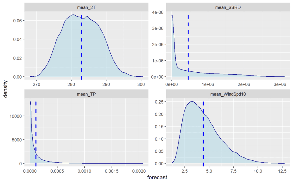
rm(met_forecast_plot)2.2.2 Demand
We start with nationally aggregated half-hourly demand, sourced from NGESO’s website (https://demandforecast.nationalgrid.com/efs_demand_forecast/faces/DataExplorer).
This demand is defined as the sum of transmission metered generation, and therefore does not include embedded generation BMUs (including embedded wind BMUs). It includes actual demand within GSPs and from directly connected consumers, with non-transmission-metered generation netted off.
These files are read-in and combined, have UTC time-stamps created. We keep the demand observations from 2014 onward. A density plot of the net-demand data is provided.
demand <-
  list.files(path = "~/RProjects/reactforecasting/data/raw/demand",
             pattern = "*.csv", full.names = T) %>%
  map_df(~fread(.))

demand$targetTime <- as.POSIXct(seq.POSIXt(strptime("2011-01-01 00:00:00",
                                                 "%Y-%m-%d %H:%M:%S", tz="UTC"),
                                        by = "30 min",
                                along.with = demand$ND), tz='UTC')
demand$net_demand <-demand$ND
demand <- demand[, c("targetTime", "net_demand",
                     'EMBEDDED_WIND_CAPACITY', 'EMBEDDED_SOLAR_CAPACITY'),
                 with = FALSE]
demand <- demand[demand$targetTime>="2014-01-01"]

ggplot(demand, aes(x=net_demand)) +
  geom_density(color="darkblue", fill="lightblue", alpha=0.5) +
  geom_histogram(aes(y=..density..), alpha=0.2,
                 color="darkblue", fill="lightblue",
                 position="identity") +
  geom_vline(aes(xintercept=mean(net_demand)),
             linetype="dashed", color="blue", size=1) +
scale_x_continuous("Net demand (MW)", labels = comma) 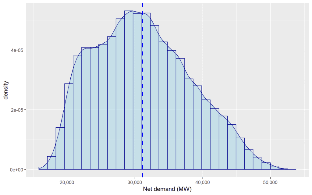
2.2.3 Autoregressive demand terms
We calculate smooth autoregressive terms for demand. In this case, this is the average demand by half-hour for the last several days, in the days prior to the forecast being issued.
max_lead_time_days <- ceiling(max_lead_time / 24)
demand[,clock_hour_factor:=as.factor(hour(targetTime)
                                     +minute(targetTime)/60)]
demand[,
       net_demand_smooth_week:=frollmean(shift(net_demand, max_lead_time_days),
                                         7,
                                         fill = NA, align = "right",
                                         na.rm = T),
       by=.(clock_hour_factor)]
demand[,
       net_demand_smooth_2week:=frollmean(shift(net_demand, max_lead_time_days),
                                          14,
                                          fill = NA, align = "right",
                                          na.rm = T),
       by=.(clock_hour_factor)]
demand[,
       net_demand_smooth_2day:=frollmean(shift(net_demand, max_lead_time_days),
                                         1,
                                         fill = NA, align = "right",
                                         na.rm = T),
       by=.(clock_hour_factor)]

demand[,
       net_demand_sd_week:=rollapply(shift(net_demand, max_lead_time_days),
                                     7, sd,
                                     fill = NA, align = "right",
                                     na.rm = T),
       by=.(clock_hour_factor)]
demand[,clock_hour_factor:=NULL]
2.2.4 Combining datasets
The demand data is then merged with the weather forecast data.
The other data objects are removed, in order to save memory.
2.3 Feature engineering
2.3.1 Calendar variables
Calendar variables are added using the functionality within ProbCast which provides hour of the year, type of day, day of the year, and a linear trend term “t” which runs from 0 to 1. We also add the calendar year and a factor variable for the month.
Smooth second order fourier terms for annual position are defined.
2.3.2 Daylight savings
We provided an adjusted clock-hour to account for day light savings, and define factor versions too.
We label days according to whether or not daylight savings time is in effect. We specifically label the days on which daylight savings starts and ends.
unique_years<- unique(data$year)
dst_start = as.Date(x = integer(0), origin = "1970-01-01")
dst_end = as.Date(x = integer(0), origin = "1970-01-01")
for(year in unique_years){
  days_in_year <- data.table(days=as.POSIXct(seq(as.Date(paste0(year,"-01-01"),
                                                         origin = "1970-01-01"),
                                                 as.Date(paste0(year,"-12-31"),
                                                         origin = "1970-01-01"),
                                      by="+1 day"), tz='Europe/London'))
  dst_days_in_year <- days_in_year[dst(days)==TRUE]
  dst_start <- c(dst_start, as.Date(min(dst_days_in_year$days),
                                    origin = "1970-01-01"))
  dst_end <-c(dst_end, as.Date(max(dst_days_in_year$days),
                               origin = "1970-01-01")+1)
}
data[, dst:='N']
data[dst(localtargetTime)==TRUE, dst:='Y']
data[date(targetTime)%in%dst_start, dst:='Start']
data[date(targetTime)%in%dst_end, dst:='End']

data[, dst:=ordered(relevel(droplevels(as.factor(dst)), ref='N'))]
rm(days_in_year, dst_days_in_year)
2.3.3 Bank holidays and types of day
We read in a csv file of bank holidays, which is merged with the main data.
all_holidays <- read_csv("~/RProjects/reactforecasting/data/raw/holidays/all_holidays.csv",
                         col_types = cols(
                           holiday = col_character(),
                           date = col_date("%d/%m/%Y")))
data[, localDate:=date(localtargetTime)]
data <- merge(data, all_holidays, all.x = TRUE,
              by.x = "localDate", by.y = "date")
data[is.na(holiday), holiday:='N']
data[,noyeardates := format(localDate, format = "%d/%m")]
rm(all_holidays)
We carry out some manual manipulation of holidays. This is to account for cases where, for example, Christmas Day occurs at the weekend such that the Christmas Day bank holiday occurs on the 27th of December. This also allows us to group together some holiday types which we expect to have very similar effects on net demand, or to eliminate some Scottish bank holidays which are not expected to have much impact.
data[, raw_holiday:=holiday]
data[holiday=="St Andrew's Day", holiday:='N']
data[holiday=="Christmas Day" & noyeardates!="25/12",
     holiday:='Christmas Substitute']
data[holiday=="Boxing Day" & noyeardates!="26/12",
     holiday:='Christmas Substitute']
data[holiday=="New Year's Day" & noyeardates!="01/01",
     holiday:='Christmas Substitute']

#Group some holidays together

data[noyeardates=="24/12", holiday:='Christmas Eve']
data[noyeardates=="25/12", holiday:='Christmas Day']
data[noyeardates=="26/12", holiday:='Boxing Day']
data[noyeardates=="31/12", holiday:='New Years Eve']
data[noyeardates=="01/01", holiday:="New Year's Day"]
data[holiday%in%c("Early May bank holiday", "Spring bank holiday",
                  "Summer bank holiday"),
     holiday:='Spring/Summer Holiday']
data[holiday%in%c("Summer bank holiday (Scotland)"),
     holiday:='N']
data[,holiday:=relevel(droplevels(as.factor(holiday)), ref='N')]
data[,holiday:=ordered(holiday)]
Factor variables for day types and holidays are processed. This results in four types of categorical variables:
- Distinguishes between all day types, and specific types of holiday.
- Distinguishes between all day types, and holidays in general.
- As per 1 but with Tuesday through Thursday grouped together.
- As per 2 but with Tuesday through Thursday grouped together.
data <- holiday_day_types(data)
dow_Rph_levels <- c("Mon", "Tue", "Wed", "Thu", "Fri", "Sat", "Sun", "Hol")
dow_RphG_levels <- c("Mon", "TueThu", "Fri", "Sat", "Sun", "Hol")
dow_RpH_levels <- c("Mon", "Tue", "Wed", "Thu", "Fri", "Sat", "Sun",
                    "Christmas Eve", "Christmas Day", "Boxing Day",
                    "New Years Eve", "New Year's Day", "Christmas Substitute",
                    "Good Friday", "Easter Monday",  "Spring/Summer Holiday")
dow_RpHG_levels <- c("Mon", "TueThu", "Fri", "Sat", "Sun",
                     "Christmas Eve", "Christmas Day", "Boxing Day",
                     "New Years Eve", "New Year's Day", "Christmas Substitute",
                     "Good Friday", "Easter Monday","Spring/Summer Holiday")
data[, dow_Rph:=ordered(dow_Rph, levels=dow_Rph_levels)]
data[, dow_RphG:=ordered(dow_RphG, levels=dow_RphG_levels)]
data[, dow_RpH:=ordered(dow_RpH, levels=dow_RpH_levels)]
data[, dow_RpHG:=ordered(dow_RpHG, levels=dow_RpHG_levels)]
We also explicitly label weekdays and weekends, and include a second variable which distinguishes between weekdays, weekends and holidays.
data[, weekend := 'Weekday']
data[dow %in% c('Sat', 'Sun'), weekend := 'Weekend']

data[, hol_weekend:= weekend]
data[holiday != "N", hol_weekend := 'Holiday']
data[, weekend:= droplevels(as.factor(weekend))]
data[, hol_weekend:= ordered(relevel(droplevels(as.factor(hol_weekend)),
                                     ref='Holiday'))]
data[,holiday_binary:=F]
data[holiday!="N",holiday_binary:=T]
2.3.4 School holidays
We label the points over the Christmas holidays, which we define as the period from 20th December to 3rd January, and assign an integer to each one.
data[, christmas:=F]
data[as.Date(format(data$targetTime, format="%d/%m"),
             "%d/%m")>as.Date("19/12", "%d/%m"), christmas:=T]
data[as.Date(format(data$targetTime, format="%d/%m"),
             "%d/%m")<as.Date("08/01", "%d/%m"), christmas:=T]

# Create a unique table of dates over Christmas (ignoring the years)
# Shuffle these so that December 20th is first.
christmasdates <- data.table()
christmasdates$noyeardates <- data[christmas==T,
                                   unique(format(localDate, format = "%d/%m"))]
christmasdates <- rbind(christmasdates[8:19], christmasdates[1:7])
christmasdates[,christmasdoy:=seq(length.out = .N)]

# Merge these back in to the main data table.
data <- merge(data, christmasdates, all.x = TRUE, all.y = FALSE,
              by = "noyeardates")
data <- data[order(targetTime)]
data[is.na(christmasdoy)==TRUE,christmasdoy:=0]
rm(christmasdates)
A similar approach is taken for other school holidays, based on a publicly sourced set of historic school holidays (available from https://data.gov.uk/dataset/aad853ad-b0d8-47a9-8491-a630b703b8a9/school-term-times).
school_dates <- read_csv("~/RProjects/reactforecasting/data/raw/holidays/school_hols.csv",
                         col_types = cols(
                           holiday = col_character(),
                           year = col_double(),
                           start = col_date("%d/%m/%Y"),
                           end = col_date("%d/%m/%Y")))
school_dates <- setDT(school_dates)
school_dates$start <- as.Date(school_dates$start)
school_dates$end <- as.Date(school_dates$end)
holidaydates <- list()
for(holiday_loop in unique(school_dates$holiday)){
  holidaydates[[holiday_loop]] <- list()
  column <- paste0(holiday_loop, "doy")
  for(year_loop in as.character(seq(from=2014, to=2019))){
    start = school_dates[(year == year_loop) & (holiday == holiday_loop),
                         .(start)][[1,1]]
    end = school_dates[(year == year_loop) & (holiday == holiday_loop),
                       "end"][[1,1]]
    holidaydates[[holiday_loop]][[year_loop]] <- data.table()
    holidaydates[[holiday_loop]][[year_loop]]$localDate <- seq(start-1,
                                                               end, by="days")
    holidaydates[[holiday_loop]][[year_loop]][,
                                              (column):=as.numeric(
                                                seq(from=0, to=1,
                                                    length.out = .N))]
  }
  holidaydates[[holiday_loop]] <- rbindlist(holidaydates[[holiday_loop]])
  holidaydates[[holiday_loop]] <- holidaydates[[holiday_loop]][(column)>0]
  data <- merge(data, holidaydates[[holiday_loop]], all.x = TRUE, all.y = FALSE,
              by = "localDate")
  data[,(paste0(column, "bin")):=F]
}
data[is.na(easterdoy)==TRUE,easterdoy:=0]
data[is.na(springdoy)==TRUE,springdoy:=0]
data[is.na(maydoy)==TRUE,maydoy:=0]
data[is.na(summerdoy)==TRUE,summerdoy:=0]
data[is.na(autumndoy)==TRUE,autumndoy:=0]
data[,school_hols:="N"]
data[christmasdoy>0,school_hols:="Christmas"]
data[easterdoy>0 & hol_weekend == "Weekday",school_hols:="Easter"]
data[springdoy>0 & hol_weekend == "Weekday",school_hols:="Spring"]
data[maydoy>0 & hol_weekend == "Weekday",school_hols:="May"]
data[summerdoy>0 & hol_weekend == "Weekday",school_hols:="Summer"]
data[autumndoy>0 & hol_weekend == "Weekday",school_hols:="Autumn"]
data[, school_hols:=relevel(droplevels(as.factor(school_hols)), ref='N')]
data[, school_hols_ord:=ordered(school_hols)]
rm(school_dates, holidaydates)
2.4 Autoregressive NWP terms
Auto-regressive demand terms are calculated. This is the 4-day lagged forecast of temperature. In reality, it may be better to use actual measured temperature.
2.6 Cross-fold validation
We set up k-fold Cross-Validation labels. We create three training cross-folds, repeating with a period of one week. These span the data from 2014 to 2018. The test-data cross-fold is all of the data from 2019. The three training cross-folds each contain about 28% of the data, and the test cross-fold contains about 17% of the data.
data <- data[order(targetTime)]

dt_issues <- data.table(issueTime = unique(data$issueTime))
dt_issues <- na.omit(dt_issues)
dt_issues[,kfold:=as.character(rep(1:3, each=7, length.out=.N))]
dt_issues[issueTime>="2018-12-31",kfold:="Test"]

data <- merge(data, dt_issues,
              all.x = TRUE, all.y = TRUE,
              by = "issueTime")
data$kfold <- na.locf(data$kfold, fromLast = TRUE)
xtabs(~kfold, data=data) %>% prop.table() %>% round(2)
## kfold
## 1 2 3 Test
## 0.28 0.27 0.27 0.17rm(dt_issues)We can also check that each fold contains a good representation of data through different months…
##       month
## kfold  January February March April  May June July August September October November December
##   1       2928     2228  2386  2880 2218 2630 2410   2524      2468    2350     2654     2294
##   2       2256     2476  2322  2188 2708 2102 2784   2170      2630    2314     2428     2516
##   3       2362     2064  2722  2132 2514 2468 2246   2746      2102    2788     2118     2630
##   Test    1382     1344  1486  1440 1488 1440 1488   1488      1440    1488     1440     1488
… and by type of day.
##       dow_Rph
## kfold   Mon  Tue  Wed  Thu  Fri  Sat  Sun  Hol
##   1    3996 4132 4172 4176 4090 4166 4412  826
##   2    3772 4014 4118 4052 3984 4080 3990  884
##   3    3464 4046 4048 4070 4022 4138 3934 1170
##   Test 2304 2400 2398 2438 2448 2496 2496  432
This only considers the number of observations of demand (i.e. for a single lead time). Clearly, there is less data available in general for specific types of bank holiday – this is part of the rationale for grouping these together where appropriate.
2.7 Missing data
We exclude data that has missing values or clearly erroneous temperatures.
data[,missing_data:=FALSE]
data[mean_2T<260,missing_data:=TRUE]
data[is.na(net_demand),missing_data:=TRUE]
data[is.na(mean_2T),missing_data:=TRUE]
data[is.na(metIssueTime),missing_data:=TRUE]
data[mean_2T_96<260,missing_data:=TRUE]
data[is.na(net_demand_smooth_week),missing_data:=TRUE]
data[is.na(mean_WindSpd10),missing_data:=TRUE]
data <- data[order(targetTime)]
missing_index <- which(data$missing_data == F)
fit_data <- copy(data)
rm(data)
3 Data exploration
Here we present some simple exploratory analysis of the net demand data.
hour_blocks <- c()
for(hour in seq(0, 20, 4)){
  fit_data[clock_hour_local%between%c(hour, hour+3.5),
       hour_block:= paste0(hour, "-", hour+4)]
  hour_blocks <- c(hour_blocks, paste0(hour, "-", hour+4))
}
fit_data[, hour_block:=ordered(hour_block, hour_blocks)]

fit_data[month%in%c('December', 'January', 'February'), Season:='Winter']
fit_data[month%in%c('March', 'April', 'May'), Season:='Spring']
fit_data[month%in%c('June', 'July', 'August'), Season:='Summer']
fit_data[month%in%c('September', 'October', 'November'), Season:='Autumn']
fit_data[, Season:=ordered(Season, c("Spring", "Summer", "Autumn", "Winter"))]
3.1 Seasonal daily profiles
First, we show the average daily profile of demand for each season. The shading around the average shows the distance between the 1st and 99th percentile of demand in each half-hour for each season, and with a separation by weekdays and weekends. This demonstrates that while are there daily patterns to demand, with seasonal and weekday/weekend effects, there is still considerable additional variation in net demand that this does not account for.
plotdata = setDT((fit_data[missing_data == F] %>%
                    group_by(clock_hour_local, weekend, Season)
                  %>% summarise(mean = mean(net_demand),
                                lower = quantile(net_demand, 0.01),
                                upper = quantile(net_demand, 0.99))))


ggplot(plotdata, mapping = aes(y = mean, x = clock_hour_local)) +
  geom_line(color="darkblue") +
  geom_ribbon(aes(ymin=plotdata$lower, ymax=plotdata$upper),
              linetype=2, alpha=0.3,
              color="darkblue",fill="lightblue") +
  facet_grid(weekend~Season) +
  scale_y_continuous("Net demand (MW)", labels=comma) +
  scale_x_continuous("Time of day (BST)")
rm(plotdata)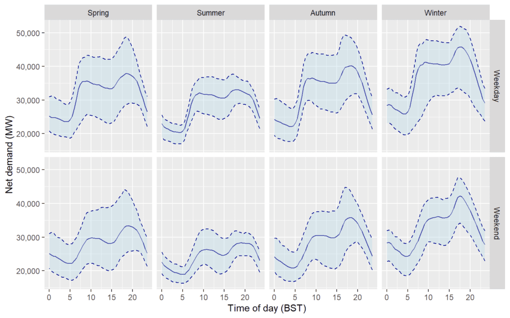
rm(plotdata)3.2 Profiles by year
We can also see that the profiles are changing over time. There is a general trend for lower demand in later years, but with a change that is more pronounced in some hours than others.
ggplot(fit_data, mapping = aes(y = net_demand,
                           x = clock_hour_local, group=as.factor(year))) +
  geom_line(stat = "summary", fun = "mean", aes(color=as.factor(year))) +
  facet_wrap(~Season) + scale_color_discrete("Year") +
  scale_y_continuous("Net demand (MW)", labels=comma) +
  scale_x_continuous("Time of day (BST)")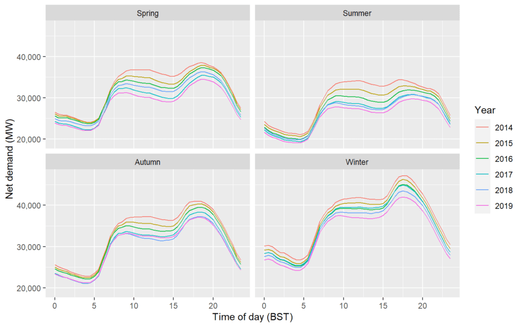
3.3 Relationship between demand and temperature
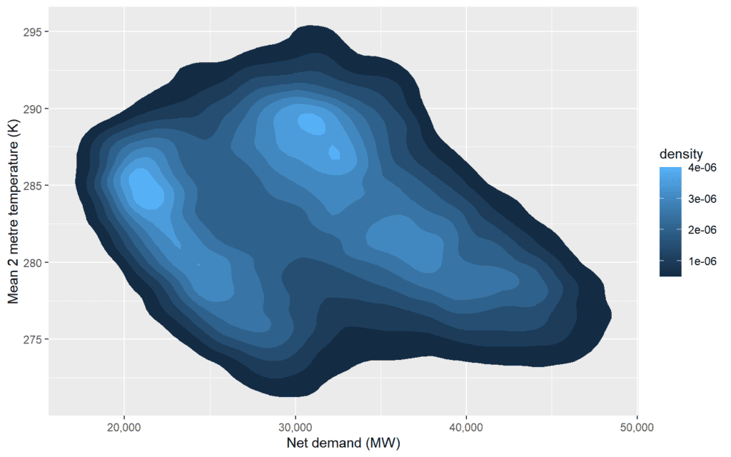
We can also observe a relationship between net-demand and average temperature. When taking all the observations, this relationship is complex, but suggests that higher temperatures are correlated with lower demands (as would be expected).
3.4 Relationships between demand and temperature by time-of-day
However, this relationship is clearly complex. Subsetting the data into 4-hour blocks simplifies this, further highlighting the importance of daily patterns within the demand data.
ggplot(fit_data, mapping = aes(x = net_demand, y = mean_2T)) +
  facet_wrap(~factor(paste0("Hours: ",hour_block), levels=paste0("Hours: ",hour_blocks))) +
  stat_density_2d(aes(fill = ..level..), geom = "polygon", bins=20) +
  scale_fill_continuous("density", na.value = NA, limits=c(0, 1e-05)) +
  scale_x_continuous("Net demand (MW)", labels=comma) +
  scale_y_continuous("Mean 2 metre temperature (K)")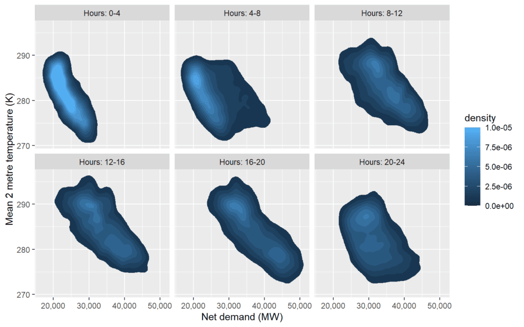
fit_data$hour_block <- NULL
fit_data$Season <- NULL
4 Model fitting
We use multiple quantile regression with Generalised Additive Models (GAMS) to produce probabilistic forecasts. The approach is explained in the covering report. We use the functionality within the ProbCast package, but define some custom functions which fit models in stages.
4.1 Model formulas
We define forms for four models. The conditional expectation of each model is fitted in three stages. This is similar to removing seasonal patterns from time-series data and aims to account for multi-collinearity within the data. The four models differ in their complexity, with Model D including the most features (e.g. this model includes an interaction term between wind-speed and temperature, to account for the effects of wind-chill).
form <- ~
  s(clock_hour_local, k=30,bs="cr") +
  s(mean_2T,k=3,bs="cr")


form_res_a <- ~
  doy_s + doy_c + doy_s2 + doy_c2 + # Fourier annual seasonality
  dow_RpH +
  school_hols +
  s(clock_hour_local, by=dow_RpH, k=15,bs="cr") +
  ti(clock_hour_local, doy, by=hol_weekend, bs=c('cr', 'cr'), k=c(15, 20)) +
  s(t, by=weekend, k=3, bs='cr')

form_res <- ~
  doy_s + doy_c + doy_s2 + doy_c2 +  # Fourier annual seasonality
  dow_RpH +
  school_hols +
  s(christmasdoy,k=5,bs="cr") +
  s(summerdoy,k=5,bs="cr") +
  s(clock_hour_local, by=dow_RpH, k=15,bs="cr") +
  ti(clock_hour_local, doy, by=hol_weekend, bs=c('cr', 'cr'), k=c(15, 20)) +
  s(t, by=weekend, k=3, bs='cr') +
  s(net_demand_smooth_week, by=weekend, k=3, bs='cr')

form_res2_a <- ~
  doy_s + doy_c + doy_s2 + doy_c2 +
  dow_Rph +
  school_hols +
  ti(clock_hour_local, t, by=weekend, bs=c('cr', 'cr'), k=c(10,3)) +
  ti(clock_hour_local, doy, by=hol_weekend, bs=c('cr', 'cr'), k=c(10, 15)) +
  s(clock_hour_local, by=weekend, k=30,bs="cr") +
  s(net_demand_smooth_week, by=weekend, k=3, bs='cr') +
  s(mean_2T,k=3,bs="cr") +
  s(mean_SSRD, by=EMBEDDED_SOLAR_CAPACITY, k=3,bs="cr") +
  s(mean_WindSpd100, by=EMBEDDED_WIND_CAPACITY, k=3,bs="cr")

form_res2_b <- ~
  doy_s + doy_c + doy_s2 + doy_c2 +
  dow_Rph +
  school_hols +
  ti(clock_hour_local, doy, by=hol_weekend, bs=c('cr', 'cr'), k=c(10, 15)) +
  s(clock_hour_local, by=weekend, k=30,bs="cr") +
  s(clock_hour_local, by=dst, k=7,bs="cr") +
  ti(clock_hour_local, t, by=weekend, bs=c('cr', 'cr'), k=c(10,3)) +
  s(net_demand_smooth_week, by=weekend, k=3, bs='cr') +
  s(mean_TP,k=10, bs="cr") +
  s(mean_2T,k=3,bs="cr") +
  s(mean_SSRD, by=EMBEDDED_SOLAR_CAPACITY, k=3,bs="cr") +
  s(mean_WindSpd100, by=EMBEDDED_WIND_CAPACITY, k=3,bs="cr")

form_res2_c <- ~
  doy_s + doy_c + doy_s2 + doy_c2 +
  dow_Rph +
  school_hols +
  ti(clock_hour_local, doy, by=hol_weekend, bs=c('cr', 'cr'), k=c(10, 15)) +
  s(clock_hour_local, by=weekend, k=30,bs="cr") +
  s(clock_hour, by=dst, k=7,bs="cr") +
  ti(clock_hour_local, t, by=weekend, bs=c('cr', 'cr'), k=c(10,3)) +
  s(net_demand_smooth_week, by=weekend, k=3, bs='cr') +
  s(mean_TP,k=10, bs="cr") +
  s(mean_2T,k=3,bs="cr") +
  ti(mean_2T, mean_WindSpd10, bs=c('cr', 'cr'), k=c(3, 3)) +
  s(mean_SSRD, by=EMBEDDED_SOLAR_CAPACITY, k=3,bs="cr") +
  s(mean_WindSpd100, by=EMBEDDED_WIND_CAPACITY, k=3,bs="cr") +
  ti(mean_SSRD, clock_hour_local, by=EMBEDDED_SOLAR_CAPACITY,
     k=c(3, 5), bs="cr") +
  ti(mean_SSRD, doy, by=EMBEDDED_SOLAR_CAPACITY,
     k=c(3, 5), bs="cr") +
  mean_2T_96

form_res2_d <- ~
  doy_s + doy_c + doy_s2 + doy_c2 +
  dow_Rph +
  school_hols +
  ti(clock_hour_local, doy, by=hol_weekend, bs=c('cr', 'cr'),
     k=c(10, 15)) +
  s(clock_hour_local, by=weekend, k=30,bs="cr") +
  s(clock_hour, by=dst, k=7,bs="cr") +
  ti(clock_hour_local, t, by=weekend, bs=c('cr', 'cr'), k=c(10,3)) +
  s(net_demand_smooth_week, by=weekend, k=3, bs='cr') +
  s(mean_TP,k=10, bs="cr") +
  s(mean_2T,k=3,bs="cr") +
  ti(mean_2T, mean_WindSpd10, bs=c('cr', 'cr'),
     k=c(3, 3)) +
  s(mean_SSRD, by=EMBEDDED_SOLAR_CAPACITY, k=3,bs="cr") +
  s(mean_WindSpd100, by=EMBEDDED_WIND_CAPACITY, k=3,bs="cr") +
  ti(mean_SSRD, clock_hour_local, by=EMBEDDED_SOLAR_CAPACITY,
     k=c(3, 5), bs="cr") +
  ti(mean_SSRD, doy, by=EMBEDDED_SOLAR_CAPACITY, k=c(3, 5), bs="cr") +
  ti(mean_WindSpd100, clock_hour_local, by=EMBEDDED_WIND_CAPACITY,
     k=c(3, 15), bs="cr") +
  ti(mean_2T, clock_hour_local, k=c(3, 10), bs="cr") +
  s(mean_2T_96, k=3)

form_list_a = c(form, form_res_a, form_res2_a)
form_list_b = c(form, form_res, form_res2_b)
form_list_c = c(form, form_res, form_res2_c)
form_list_d = c(form, form_res, form_res2_d)
Uncertainty in the forecasts is modeled by fitting a GAM to the absolute value of the residuals. This GAM includes terms that we expect may be associated with increased uncertainty in the forecasts. For example, we include terms for the standard deviations across the country of some of the meteorological forecasts. The quantile regression is then a linear combination of the forecasted absolute value of the residual (labeled gam_sd) with some other variables such as the time-of-day and the month.
form_res_sq <- ~
  s(gam_pred, k=4, bs='cr')  +
  doy_s + doy_c +
  dow_RphG +
  school_hols +
  s(clock_hour_local, by=weekend, k=20,bs="cr") +
  ti(clock_hour_local, doy, by=hol_weekend, bs=c('cr', 'cr'), k=c(7, 7)) +
  ti(clock_hour_local, t, bs=c('cr', 'cr'), k=c(10, 3)) +
  s(t, k=3, bs='cr')  +
  s(net_demand_sd_week, by=weekend, k=4, bs='cr') +
  s(sd_2T,k=4,bs="cr") +
  I(sd_SSRD*EMBEDDED_SOLAR_CAPACITY) +
  I(sd_WindSpd100*EMBEDDED_WIND_CAPACITY)

form_qr <- ~clock_hour_local_factor + month + gam_sd +
  I(sd_SSRD*EMBEDDED_SOLAR_CAPACITY) +
  I(sd_WindSpd100*EMBEDDED_WIND_CAPACITY)
Note that, to an extent, this approach is a compromise, and it might actually be better to directly model generalised additive models for each quantile, for example using the qgam package. However, this is currently much more computationally expensive.
Finally, we also explore a simple benchmark model. We include terms to account for embedded generation within this benchmark model.
benchmark <-  ~
  t  +
  month +
  dow_RpH  +
  clock_hour_local_factor +
  clock_hour_local_factor:dow_RpH  +
  mean_2T +
  I(mean_2T^2)+
  I(mean_2T^3)+
  mean_2T:month +
  I(mean_2T^2):month +
  I(mean_2T^3):month +
  mean_2T:clock_hour_local_factor +
  I(mean_2T^2):clock_hour_local_factor +
  I(mean_2T^3):clock_hour_local_factor +
  mean_WindSpd100 +
  I(mean_SSRD * EMBEDDED_SOLAR_CAPACITY / 1e9)

bench_res_sq <- ~
  gam_pred +
  I(gam_pred^2) +
  clock_hour_local_factor +
  dow_RphG +
  mean_2T +
  mean_WindSpd100 +
  I(mean_SSRD * EMBEDDED_SOLAR_CAPACITY / 1e9)
We assemble all these models forms within a list.
list_of_forms <- list(bench = c(benchmark),
                      model_a = form_list_a,
                      model_b = form_list_b,
                      model_c = form_list_c,
                      model_d = form_list_d)
list_of_res_sq_forms <- list(bench = bench_res_sq,
                             model_a = form_res_sq,
                             model_b = form_res_sq,
                             model_c = form_res_sq,
                             model_d = form_res_sq)
rm(form_list_a, form_list_b, form_list_c, form_list_d)
4.2 Model fitting
The quantile regression GAMs are fitted to the data using the custom function, for evenly spaced quantiles between the 5th and 95th, as well as the 2.5th and 97.5th. The models are initially fitted with all of the 2019 data withheld as test data. After this initial fitting, the models are retrained and forecasts are reissued on a rolling monthly basis.
if(file.exists(
  "~/RProjects/reactforecasting/data/output/R_objects/DaysAhead_NetDemand/list_of_updated.rds")){
  print("Loading fitted models.")
  list_of_updated <- readRDS("~/RProjects/reactforecasting/data/output/R_objects/DaysAhead_NetDemand/list_of_updated.rds")
  }else{
  list_of_models <- list()
  list_of_updated <- list()
  for(name in names(list_of_forms)){
    print(paste0("Model: ", name))
    selected_list_of_forms <- list_of_forms[[name]]
    selected_res_sq_form <- list_of_res_sq_forms[[name]]
    qgam <- qreg_gam_stages(data = fit_data,
                            formula_list = selected_list_of_forms,
                            response = "net_demand",
                            model_r_sq = T,
                            formula_r_sq = selected_res_sq_form,
                            kfold = "kfold",
                            exclude_train = 'missing_data',
                            formula_qr = form_qr,
                            weights = weights,
                            quantiles = c(0.025, seq(0.05, 0.95, 0.05),
                                          0.975)
                            )
    list_of_models[[name]] <- qgam
    qgam_update <- copy(qgam)
    rm(qgam)
    test_issues <- fit_data[kfold=="Test",(unique(issueTime))]
    weekly_test_issues <- (split(split(test_issues, test_issues),
                                 ceiling(seq_along(test_issues)/28)))
    for(week in 1:(length(weekly_test_issues)-1)){

      week_data = fit_data[issueTime%in%weekly_test_issues[[week]] & kfold=="Test",]
      next_week_data = fit_data[issueTime%in%weekly_test_issues[[week+1]] & kfold=="Test",]
      next_week_index = which(fit_data$issueTime%in%weekly_test_issues[[week+1]]
                              &fit_data$kfold=="Test" )

      print(paste0("Updating forecast for 4-week block ",
                   week," of ",length(weekly_test_issues)-1))

      ## Update "Test" model with previous block's data
      qgam_update <- qreg_gam_stages.update(qgam_update,newdata = week_data)

      ## Make new predictions for current block
      new_preds <- predict(qgam_update,newdata = next_week_data, predict_quantiles = T)

      ## Update test predictions for current block
      qgam_update$mqr_pred[next_week_index,] <- new_preds$mqr_pred
      qgam_update$models$gam_pred$gam_pred[next_week_index] <- new_preds$gam_pred
      qgam_update$models$gam_pred$gam_sd[next_week_index] <- new_preds$gam_sd

      rm(new_preds)
    }
    list_of_updated[[name]] <- qgam_update
    rm(qgam_update)
    rm(test_issues)
    rm(weekly_test_issues)
    rm(week_data)
    rm(next_week_data)
    rm(selected_list_of_forms)
    rm(selected_res_sq_form)
  }
  saveRDS(list_of_models,
          "~/RProjects/reactforecasting/data/output/R_objects/DaysAhead_NetDemand/list_of_models.rds")
  rm(list_of_models)
  saveRDS(list_of_updated,
          "~/RProjects/reactforecasting/data/output/R_objects/DaysAhead_NetDemand/list_of_updated.rds")
}
5 Evaluation
We then evaluate the models and select the model which performs the best. Note that, as in other work packages and workbooks, we are evaluating the performance of the models on a hold-out testing data set.
5.1 Model selection
Model selection is based on the principle of maximising sharpness subject to calibration.
5.1.1 Mean Absolute Error
We initially examine the mean absolute error (MAE) of the expected value forecast. We can see that the addition of further features results in an improvement of the accuracy of the expected value forecasts.
mae_data <- data.table(model = character(),
                       mean = numeric(),
                       median = numeric())
for(name in names(list_of_forms)){
  qgam_update_name<-list_of_updated[[name]]
  gam_pred <- qgam_update_name$models$gam_pred$gam_pred[missing_index]
  gam_resid <- fit_data$net_demand[missing_index] - gam_pred
  mean_absolute_error <- mean(abs(gam_resid), na.rm=T)
  median_absolute_error <- median(abs(gam_resid), na.rm=T)
  mae_data <- add_row(mae_data, model = name,
                      mean = mean_absolute_error,
                      median = median_absolute_error)
  rm(qgam_update_name)
}
mae_data  %>% mutate_at(vars(mean, median), funs(round(., 1)))
## model mean median
## 1: bench 1041.8 809.4
## 2: model_a 946.2 728.4
## 3: model_b 878.4 683.4
## 4: model_c 856.8 663.7
## 5: model_d 835.0 649.1mae_data[, model:=as.factor(model)]
mae_data %>% pivot_longer(cols = c(mean, median),
names_to = "metric", values_to = "absolute_error") %>%
ggplot(aes(x=model, y=absolute_error, color=model, fill=model)) +
geom_col() +
coord_flip(expand = T) +
scale_x_discrete("Model", limits = rev) + facet_wrap(~str_to_title(metric)) +
scale_y_continuous("Absolute error (MW)") +
geom_text(aes(label = round(absolute_error,2)), hjust=1, colour = "black")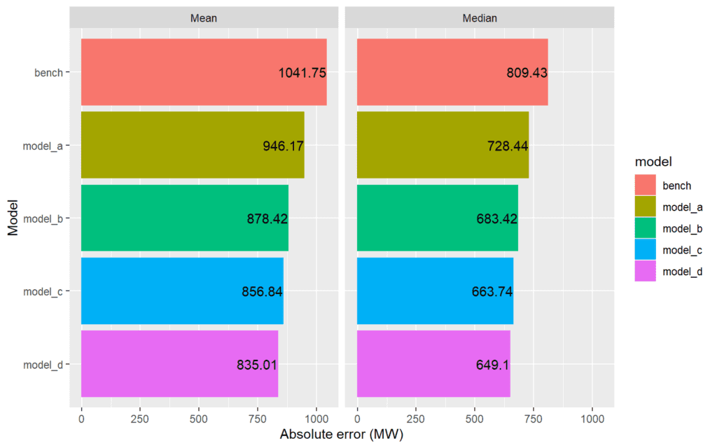
rm(mae_data)The MAE of the expected value/deterministic parts of the models are comparable with the performance of NGESO’s existing demand forecasts, although our understanding is that NGESO’s current deterministic forecasts achieve slightly lower MAE. One important aspect of demand forecasting that we have not accounted for is the alteration to forecasts due to national events, such as sports and TV events and eclipses. NGESO manually adjusts its forecasts based one experience to deal with these events, but we have not made any sort of similar adjustment within our model.
We have also calculated the median absolute error of each model. These values are lower than the mean absolute error for every model, which suggests that the distribution of errors is heavily skewed. Large errors due to “special” days and national events could be a possible cause of such a skew in the distribution of errors.
In the rest of our evaluation we will consider the full probabilistic forecast. This means we no longer think about forecast error but instead about the uncertainty within the forecast.
5.1.2 Calibration
We calculate calibration (and sharpness) metrics for each model.
seasons_list <- list("Spring" = c("March", "April", "May"),
                     "Summer" = c("June", "July", "August"),
                     "Autumn" = c("September", "October", "November"),
                     "Winter" = c("December", "January", "February"))
reliability_combined <- c()
pinball_combined <- c()
sharpness_combined <- c()
reliability_combined_subsets <- c()
pinball_combined_subset <- c()
sharpness_combined_subset <- c()
for(name in names(list_of_updated)){
  qgam_update_name<-list_of_updated[[name]]

  new_reliability <- reliability(qgam_update_name$mqr_pred[missing_index],
                                 realisations = fit_data$net_demand[missing_index],
                                 plot.it = F)
  new_reliability$model <- name
  reliability_combined <- rbind(reliability_combined, new_reliability)

  new_pinball <- pinball(qgam_update_name$mqr_pred[missing_index],
                         realisations = fit_data$net_demand[missing_index],
                         plot.it = F)
  new_pinball$model <- name
  pinball_combined <- rbind(pinball_combined, new_pinball)

  new_sharpness <- sharpness(qgam_update_name$mqr_pred[missing_index])
  new_sharpness$model <- name
  sharpness_combined <- rbind(sharpness_combined, new_sharpness)

  hour_blocks <- c()
  for(hour in seq(0, 20, 4)){
    hour_blocks <- c(hour_blocks, paste0(hour,"-",hour+4))
    for(season in names(seasons_list)){
      months <- seasons_list[[season]]
      level_index <- which(between(fit_data$clock_hour_local, hour, hour+3.99)
                           & fit_data$month%in%months
                           & fit_data$missing_data == F)

      new_reliability_subsets <- reliability(qgam_update_name$mqr_pred[level_index],
                                             realisations = fit_data$net_demand[level_index],
                                             plot.it = F)
      new_reliability_subsets$model <- name
      new_reliability_subsets$hours <- paste0(hour,"-",hour+4)
      new_reliability_subsets$months <- season
      reliability_combined_subsets <- rbind(reliability_combined_subsets, new_reliability_subsets)

      new_pinball_subsets <- pinball(qgam_update_name$mqr_pred[level_index],
                                     realisations = fit_data$net_demand[level_index],
                                     plot.it = F)
      new_pinball_subsets$model <- name
      new_pinball_subsets$hours <- paste0(hour,"-",hour+4)
      new_pinball_subsets$months <- season
      pinball_combined_subset <- rbind(pinball_combined_subset, new_pinball_subsets)

      new_sharpness_subsets <- sharpness(qgam_update_name$mqr_pred[level_index])
      new_sharpness_subsets$model <- name
      new_sharpness_subsets$hours <- paste0(hour,"-",hour+4)
      new_sharpness_subsets$months <- season
      sharpness_combined_subset <- rbind(sharpness_combined_subset, new_sharpness_subsets)
    }
  }
  rm(qgam_update_name)
}
reliability_combined <- setDT(reliability_combined)
pinball_combined <- setDT(pinball_combined)
sharpness_combined <- setDT(sharpness_combined)

reliability_combined_subsets <- setDT(reliability_combined_subsets)
reliability_combined_subsets[, hours:=ordered(hours, hour_blocks)]
reliability_combined_subsets[, months:=ordered(months, names(seasons_list))]

pinball_combined_subset <- setDT(pinball_combined_subset)
pinball_combined_subset[, hours:=ordered(hours, hour_blocks)]
pinball_combined_subset[, months:=ordered(months, names(seasons_list))]

sharpness_combined_subset <- setDT(sharpness_combined_subset)
sharpness_combined_subset[, hours:=ordered(hours, hour_blocks)]
sharpness_combined_subset[, months:=ordered(months, names(seasons_list))]
A QQ plot is used to examine the calibration of the models. All of the models are reasonably well calibrated when looking at all of the data.
ggplotly(ggplot(setDT(reliability_combined),
       aes(x=Nominal, y=Empirical, group=model,
           text=paste0('Model: ', model,
                       '<br>Nominal: ', paste0(round(Nominal*100,2),"%"),
           '<br>Empirical: ', paste0(round(Empirical*100,2),"%")
           ))) +
  geom_line(aes(color=model)) +
  geom_point(aes(color=model), size=1) +
  geom_abline(intercept = 0, slope = 1, color="black", linetype="dashed") +
  scale_x_continuous(labels = percent) + scale_y_continuous(labels = percent),
  tooltip=c("text"))
However, partitioning the forecasts into groups of months and groups of hours (4-hour blocks) shows that the Benchmark model is very poorly calibrated for some combinations of time-of-day and time-of-year (e.g. 8am-noon in Spring).
p <- ggplot(reliability_combined_subsets,
       aes(x=Nominal, y=Empirical, group=model,
           text=paste0('Model: ', model,
                       '<br>Season: ',months,
                       '<br>Hour-block: ',hours,
                       '<br>Nominal: ', paste0(round(Nominal*100,2),"%"),
                       '<br>Empirical: ', paste0(round(Empirical*100,2),"%"))
           )) +
  geom_line(aes(color=model)) +
  geom_point(aes(color=model), size=2/3) +
  geom_abline(intercept = 0, slope = 1, color="black", linetype="dashed") +
  scale_x_continuous(labels = percent) + scale_y_continuous(labels = percent) +
  facet_grid(vars(hours), vars(months))
ggplotly(p, tooltip=c("text")) %>% layout_ggplotly(y=-0.07)
The calibration of the selected model will be examined in more detail later.
5.1.3 Sharpness
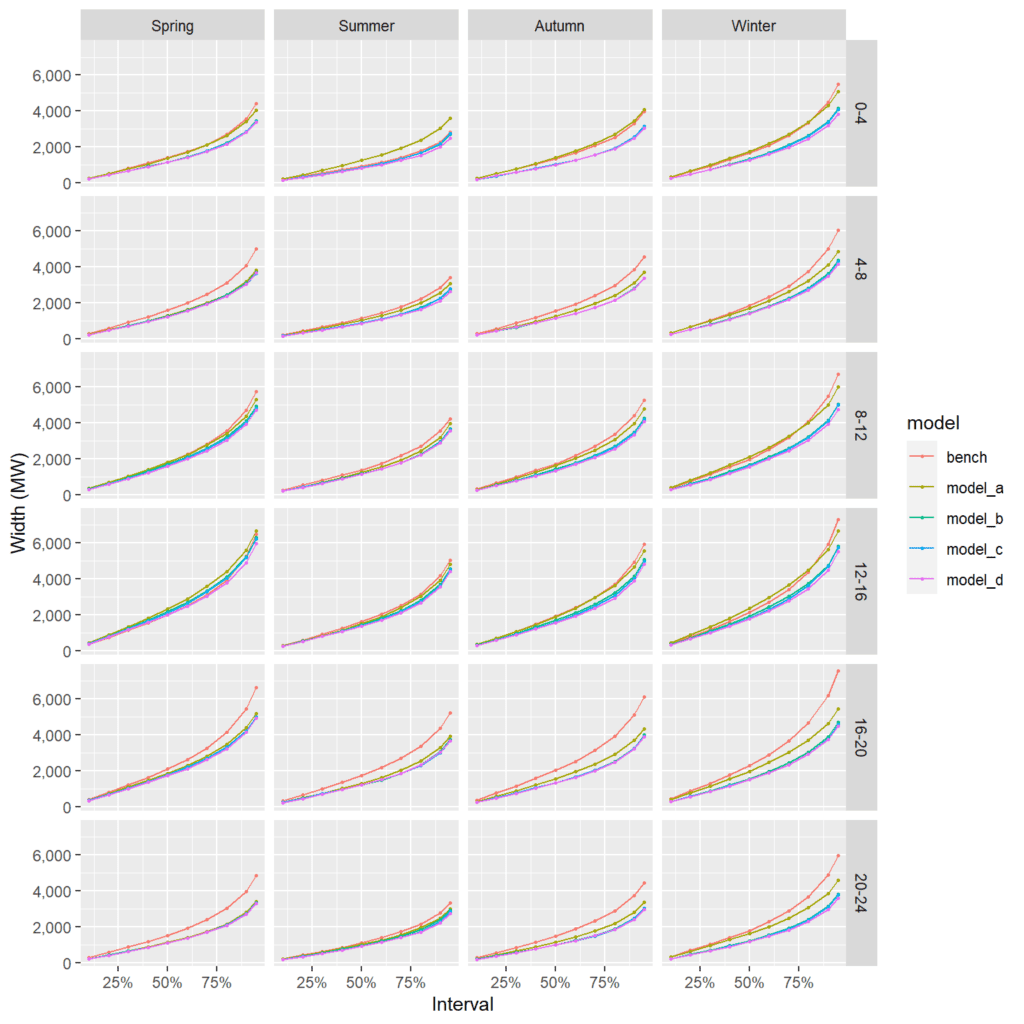
As expected (based on the MAE), the addition of further features improves the sharpness of the model; the benchmark model has the widest interval widths, and Model D has the narrowest
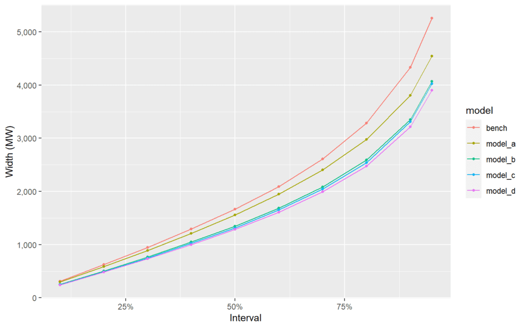
This impact is particularly pronounced for some combinations of season and time-of-day. The difference between the four GAM-based models is much more subtle.
5.1.4 Pinball losses
These observations are confirmed by the pinball losses – where the benchmark model has the highest losses and Model D has the lowest.
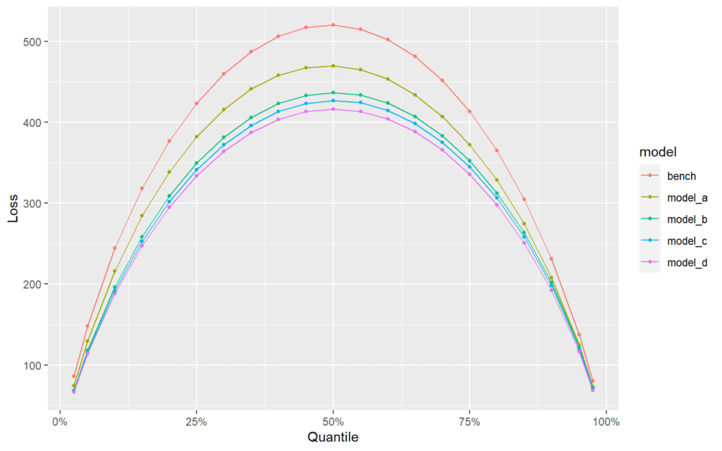
Again, this impact is particularly pronounced for some combinations of season and time-of-day. The difference between the four GAM-based models is much more subtle.

5.1.5 Model selection
Based on these metrics, Model D looks to be the sharpest and is still well calibrated. Therefore, we select this model for the production of forecasts.
qgam_update <- list_of_updated[["model_d"]]
fit_data$gam_pred <- qgam_update$models$gam_pred$gam_pred
fit_data$gam_resid <- fit_data$net_demand - fit_data$gam_pred
fit_data$gam_abs_resid <- abs(fit_data$gam_resid)
fit_data$gam_sd <- qgam_update$models$gam_pred$gam_sd
mqr_pred <- qgam_update$mqr_pred
realisations <- fit_data$net_demand
saveRDS(qgam_update,"~/RProjects/reactforecasting/data/output/R_objects/DaysAhead_NetDemand/qgam_update.rds")
5.2 Evaluation of selected model
5.2.1 Calibration
The calibration of the selected model is explored in more detail.
Calibration of all predictions
We start with a QQ plot looking at all predictions.
p <- ggplot(setDT(reliability(mqr_pred[missing_index],
                         realisations = realisations[missing_index],
                         plot.it = F)),
         aes(x=Nominal, y=Empirical,
             text=paste0('Nominal: ', paste0(round(Nominal*100,2),"%"),
                       '<br>Empirical: ', paste0(round(Empirical*100,2),"%"))
             )) +
  geom_line(color='blue', group=1) +
  geom_point(color='blue') +
  geom_abline(intercept = 0, slope = 1, color="black", linetype="dashed") +
  scale_x_continuous(labels = percent) + scale_y_continuous(labels = percent)
ggplotly(p, tooltip=c("text"))
Calibration by cross-fold
We can examine the calibration of each of the cross-folds. There is some deviation for individual cross-folds, but this is to be expected since each fold contains a smaller number of samples than the combined data-set.
p <- ggplot(setDT(reliability(mqr_pred[missing_index],
                         realisations = realisations[missing_index],
                         kfold = fit_data$kfold[missing_index], plot.it=F)),
         aes(x=Nominal, y=Empirical, group=kfold,
             text=paste0("Cross-fold: ", kfold,
                         '<br>Nominal: ', paste0(round(Nominal*100,2),"%"),
                       '<br>Empirical: ', paste0(round(Empirical*100,2),"%")))) +
  geom_line(aes(color=kfold)) +
  geom_point(aes(color=kfold)) +
  geom_abline(intercept = 0, slope = 1, color="black", linetype="dashed") +
  scale_x_continuous(labels = percent) + scale_y_continuous(labels = percent)
ggplotly(p, tooltip=c("text"))
Calibration by season and time-of-day
The partitioned QQ plots of just the selected model are presented again.
p <- ggplot(setDT(reliability_combined_subsets)[model=='model_d'],
         aes(x=Nominal, y=Empirical, group=months,
             text=paste0('Season: ',months,
                         '<br>Hour-block: ',hours,
                         '<br>Nominal: ', paste0(round(Nominal*100,2),"%"),
                         '<br>Empirical: ', paste0(round(Empirical*100,2),"%")))) +
  geom_line(aes(color=months)) +
  geom_point(aes(color=months)) +
  geom_abline(intercept = 0, slope = 1, color="black", linetype="dashed") +
  facet_wrap(vars(hours), ncol=2) +
  scale_x_continuous(labels = percent) + scale_y_continuous(labels = percent) +
  scale_color_discrete("Season")
ggplotly(p, tooltip=c("text")) %>% layout_ggplotly(y=-0.07)
Calibration by meteorological features
temp_data <- rbind(cbind(reliability(mqr_pred[missing_index],
                                     realisations = realisations[missing_index],
                                     subsets = fit_data$mean_2T[missing_index],
                                     plot.it = F),
                         feature = "2m temperature"),
                   cbind(reliability(mqr_pred[missing_index],
                                     realisations = realisations[missing_index],
                                     subsets = fit_data$mean_WindSpd10[missing_index],
                                     plot.it = F),
                         feature = "10m wind speed"),
                   cbind(reliability(mqr_pred[missing_index],
                                     realisations = realisations[missing_index],
                                     subsets = fit_data$mean_SSRD[missing_index],
                                     plot.it = F),
                         feature = "SSRD"),
                   cbind(reliability(mqr_pred[missing_index],
                                     realisations = realisations[missing_index],
                                     subsets = fit_data$mean_TP[missing_index],
                                     plot.it = F),
                         feature = "Precipitation")
                   )


p <- ggplot(setDT(temp_data)[is.na(subset)==F],
       aes(x=Nominal, y=Empirical, group=as.factor(paste("Bin",subset)),
           text=paste0("Feature: ", feature,
                       "Bin: ", subset,
                         '<br>Nominal: ', paste0(round(Nominal*100,2),"%"),
                       '<br>Empirical: ', paste0(round(Empirical*100,2),"%"))
           )) +
  geom_line(aes(color=as.factor(paste("Bin",subset)))) +
  geom_point(aes(color=as.factor(paste("Bin",subset)))) +
  geom_abline(intercept = 0, slope = 1, color="black", linetype="dashed") +
  scale_color_discrete(name ="Bin") + theme(legend.position="top")+
  scale_x_continuous(labels = percent) + scale_y_continuous(labels = percent) +
  facet_wrap(~feature, ncol=2)
ggplotly(p, tooltip=c("text")) %>% layout_ggplotly(y=-0.07)rm(temp_data)We conclude that the model is sufficiently well calibrated to be used for the production of forecasts, although it is possible that calibration could be improved for subsets of temperature, wind speed and irradiance.
5.2.2 Sharpness
Sharpness by type of day
We evaluate the sharpness of the model by types of day, including the seven days of the week and holidays in general. Unsurprisingly, we find that the model’s predictions are not as skillful for holidays as they are for non-holidays (although holidays only make up 3% of the data). We expect that, in practice, expected value forecasts for holidays would be subject to some manual adjustment which could help to improve this. It is also noteworthy that the model is somewhat less skillful on Mondays than other days of the week and slightly less skillful on weekends than other days of the week, although this is less pronounced than shorter lead-times.
sharpness_combined_daytypes <- c()
for(dow_Rph in unique(fit_data$dow_Rph)){
  level_index <- which((fit_data$missing_data == F)
                       & (fit_data$dow_Rph == dow_Rph))
  sharpness_daytype <- sharpness(mqr_pred[level_index])
  sharpness_daytype$dow_Rph <- dow_Rph
  sharpness_combined_daytypes <- rbind(sharpness_combined_daytypes, sharpness_daytype)
}
sharpness_combined_daytypes <- setDT(sharpness_combined_daytypes)
sharpness_combined_daytypes[, dow_Rph:=ordered(dow_Rph, levels=dow_Rph_levels)]

ggplot(setDT(sharpness_combined_daytypes),
       aes(x=Interval, y=Width, group=dow_Rph)) +
  geom_line(aes(color=dow_Rph)) +
  geom_point(aes(color=dow_Rph), size=1) +
  scale_color_discrete("Type of day") + scale_x_continuous(labels=percent) +
  scale_y_continuous("Width (MW)", labels=comma)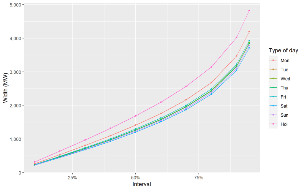
xtabs(~dow_Rph, fit_data[missing_index]) %>% prop.table() %>% round(3)## dow_Rph
## Mon Tue Wed Thu Fri Sat Sun Hol
## 0.129 0.140 0.142 0.140 0.139 0.142 0.139 0.030Distribution of interval width
Sharpness diagrams only show average interval widths. We can also look at the distribution of specific interval widths – i.e. the distribution of the width between quantile 2.5 and quantile 97.5. The figures below shows the empirical distribution of this range for the entire data (excluding bad data), and then separated out again by day type. Again, we can see that the predictions are less sharp for holidays.
fit_data$range95 <- mqr_pred$q97.5 - mqr_pred$q2.5
width_plot <- ggplot(fit_data[missing_index], aes(x=range95)) +
  geom_density(color="blue") +
  xlab("Central 95% interquantile range (MW)") +
  scale_color_discrete() + scale_x_continuous(labels=comma)
day_width_plot <- ggplot(fit_data[missing_index], aes(x=range95, group=dow_Rph)) +
  geom_density(aes(color=dow_Rph)) +
  xlab("Central 95%  interquantile range (MW)") +
  scale_color_discrete("Type of day") + scale_x_continuous(labels=comma)
ggarrange(width_plot, day_width_plot)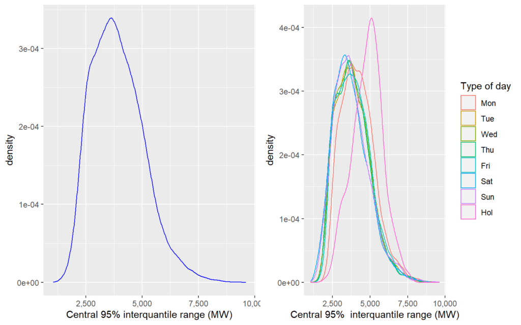
rm(width_plot, day_width_plot)5.2.3 Pinball
We can confirm our conclusions about calibration and sharpness by examining pinball losses by type of day.
pinball_combined_daytypes <- c()
for(dow_Rph in unique(fit_data$dow_Rph)){
  level_index <- which((fit_data$missing_data == F)
                       & (fit_data$dow_Rph == dow_Rph))
  pinball_daytype <- pinball(mqr_pred[level_index],
                             realisations = fit_data$net_demand[level_index],
                             plot.it = F)
  pinball_daytype$dow_Rph <- dow_Rph
  pinball_combined_daytypes <- rbind(pinball_combined_daytypes, pinball_daytype)
}
pinball_combined_daytypes <- setDT(pinball_combined_daytypes)
pinball_combined_daytypes[, dow_Rph:=ordered(dow_Rph, levels=dow_Rph_levels)]

ggplot(setDT(pinball_combined_daytypes),
       aes(x=Quantile, y=Loss, group=dow_Rph)) +
  geom_line(aes(color=dow_Rph)) +
  geom_point(aes(color=dow_Rph), size=1) +
  scale_color_discrete("Type of day") + scale_x_continuous(labels=percent)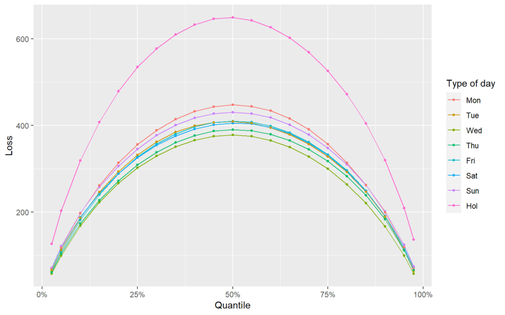
5.3 Interpreting the model
One very helpful feature of GAMs is that the individual smooth and parametric terms within the model can be easily visualised. We processes the plots using the mcgViz package.
For brevity, we only present a selection of the interpretation plots within this workbook.
5.3.1 Conditional expected values
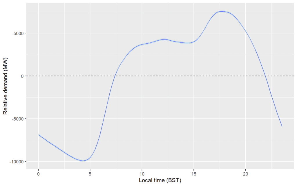
Effect of time-of-day
For example, the plot shows the relative effect of the local time-of-day on net demand. Demand is typically 10GW lower at 4:30am than it is 7:30am or 10pm, but at 5:30pm it is typically 7.5GW higher.
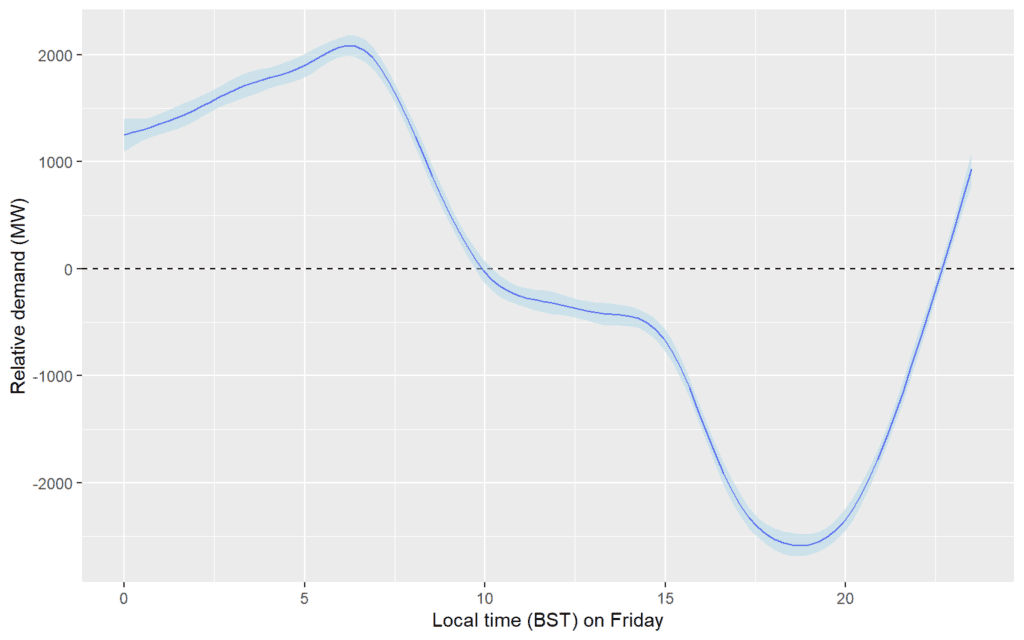
Effect of time-of-day on a Friday
The model specifies additional effects for different types of day and holiday. For example, the plot below shows the relative effect of different times of day on typical Friday demand. Note that the shaded interval reflects that there is greater uncertainty about the impact of specific days than there is about the more generic daily profile.
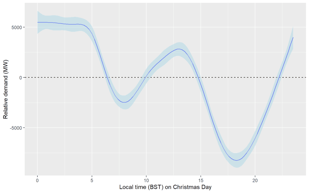
Effect of time-of-day during Christmas day
The plot below shows the impact of time-of-day on the demand during Christmas day, with lower demand in the morning and evening. Note again that there is still greater uncertainty for this specific day of the year.
Impact of temperature
The influence of forecast temperature on demand is shown in the plot below. (This requires some manipulation of the mgcViz plots, since there is a term for temperature in both the 1st and 3rd stage of the model.)
temp_plot <- plot(sm(model_r0, 2))
temp_plot$data$fit$y <- plot(sm(model_r0, 2))$data$fit$y +
  plot(sm(model_r2, 13))$data$fit$y
temp_plot$data$fit$se <- plot(sm(model_r0, 2))$data$fit$se +
  plot(sm(model_r2, 13))$data$fit$se
temp_plot$data$fit$ty <- plot(sm(model_r0, 2))$data$fit$ty +
  plot(sm(model_r2, 13))$data$fit$ty
temp_plot +
  geom_hline(yintercept = 0, linetype = 'dashed') +
  l_fitLine(color="blue") +
  l_ciPoly(fill = "lightblue", alpha=0.5) +
  theme_grey() + xlab("Average temperature (K)") + ylab("Relative demand (MW)")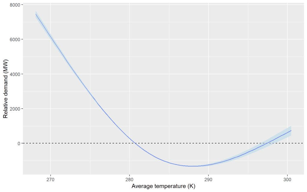
Daily and annual interactions
We can similarly examine a 2D plot of the relative influence of different combinations of local time and day-of-the-year. This shows the propensity, for example, for demand to be higher around midnight in the summer.
hour_doy_plot <- plot(sm(model_r1, 18))
hour_doy_plot$data$fit$z <- plot(sm(model_r1, 18))$data$fit$z +
  plot(sm(model_r2, 1))$data$fit$z
hour_doy_plot$data$fit$se <- plot(sm(model_r1, 18))$data$fit$se +
  plot(sm(model_r2, 1))$data$fit$se
hour_doy_plot$data$fit$tz <- plot(sm(model_r1, 18))$data$fit$tz +
  plot(sm(model_r2, 1))$data$fit$tz
hour_doy_plot + theme_gray() +
  l_fitRaster() + l_fitContour() +
  xlab("Local time (BST)") +
  ylab("Day of the year") + labs(title = NULL) +
scale_fill_gradient2() 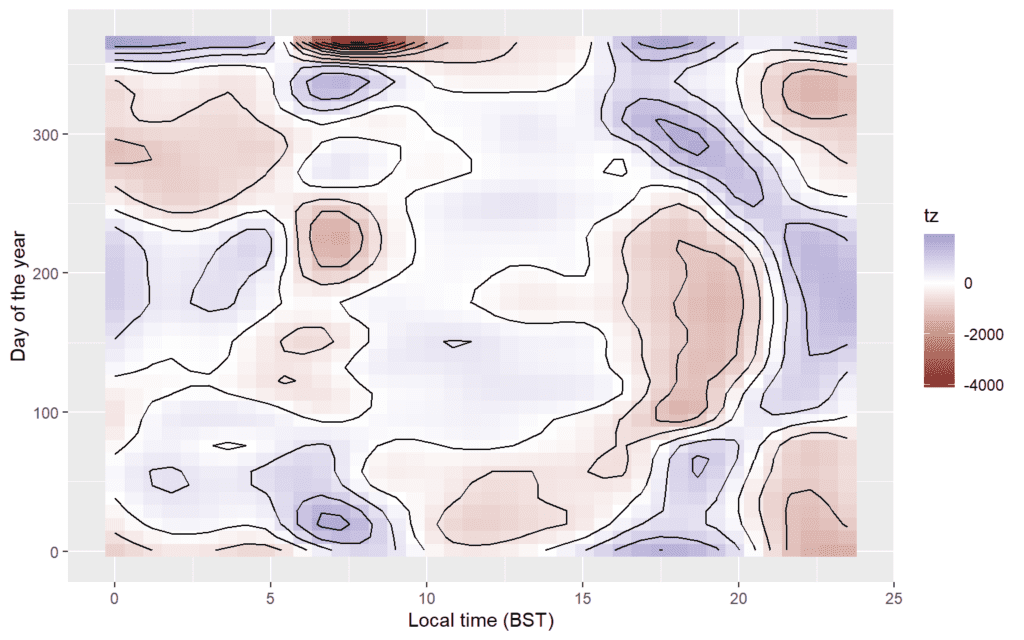
5.3.2 Probability density
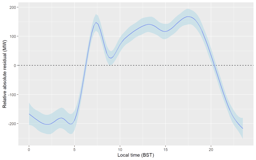
We can also visualise the GAM terms used to model the absolute value of the residuals, which ultimately is used to drive the modeling of the uncertainty around the expected value. For example, the plot below shows the expected value of the absolute value of the residual by the time-of-day on Weekdays, showing that there is greater uncertainty during the morning demand ramp, and also during the evening peak period.
6 Extreme quantiles
Quantile regression is used to model quantiles between the 2.5th and 97.5th. For quantiles below the 2.5th and above the 97.5th, we fit models based on Extreme Value Theory, using a Generalised Pareto Distribution (GPD).
6.1 Models for extreme quantiles
6.1.1 Model fitting
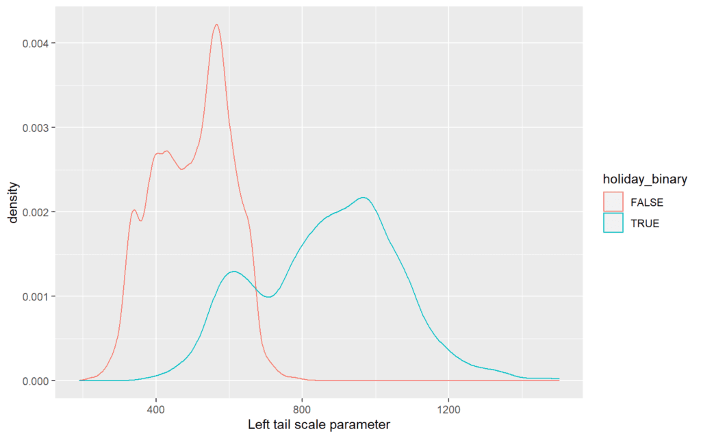
For both tails, we assume the scale of the GPD is a linear function of the expected value of the forecast, and terms related to wind and solar output as well as the lead time. We assume the shape of the GPD does not change. We allow the scale of the right tails to be different for holidays, by using the categorical variable holiday_binary.
ev_form_right <- list(net_demand ~ gam_pred + s(gam_pred, k=4) +
                        I(mean_SSRD*EMBEDDED_SOLAR_CAPACITY) +
                        I(mean_WindSpd100*EMBEDDED_WIND_CAPACITY)+ holiday_binary,
                      ~ 1)

ev_form_left <- list(net_demand ~ gam_pred + s(gam_pred, k=4) +
                        I(mean_SSRD*EMBEDDED_SOLAR_CAPACITY) +
                        I(mean_WindSpd100*EMBEDDED_WIND_CAPACITY) + holiday_binary,
                     ~ 1)
We fit the tail models, adding columns to the fit_data object columns for the GPD parameters and the “tail residual” (i.e. the gap between the realised demand and either the 2.5th or 97.5th quantile).
6.1.2 Tail residuals
The plots below show the “tail residuals” of the data set, i.e. the extent to which values of demand exceed the 97.5th quantile prediction, or are lower than the 2.5th quantile. The shape of the data is fairly well suited to modeling with extreme value theory, although it is clear that the poorer performance of the model for holiday days is having an impact and leads to some outliers in both tails.
tail_left <- ggplot(fit_data[missing_data==F], aes(x=tail_l_resid, group=dow_Rph)) +
  geom_density(aes(color=dow_Rph), alpha=0) +
  coord_cartesian(xlim=c(0, 4000), ylim=c(0, 1e-04), expand = FALSE) +
  scale_color_discrete("Day type") + xlab("Residual below 2.5th quantile (MW)")

tail_right <- ggplot(fit_data[missing_data==F], aes(x=tail_r_resid, group=dow_Rph)) +
  geom_density(aes(color=dow_Rph), alpha=0) +
  coord_cartesian(xlim=c(0, 4000), ylim=c(0, 1e-04), expand = FALSE) +
  scale_color_discrete("Day type") + xlab("Residual beyond 97.5th quantile (MW)")

ggarrange(tail_left, tail_right, ncol=2)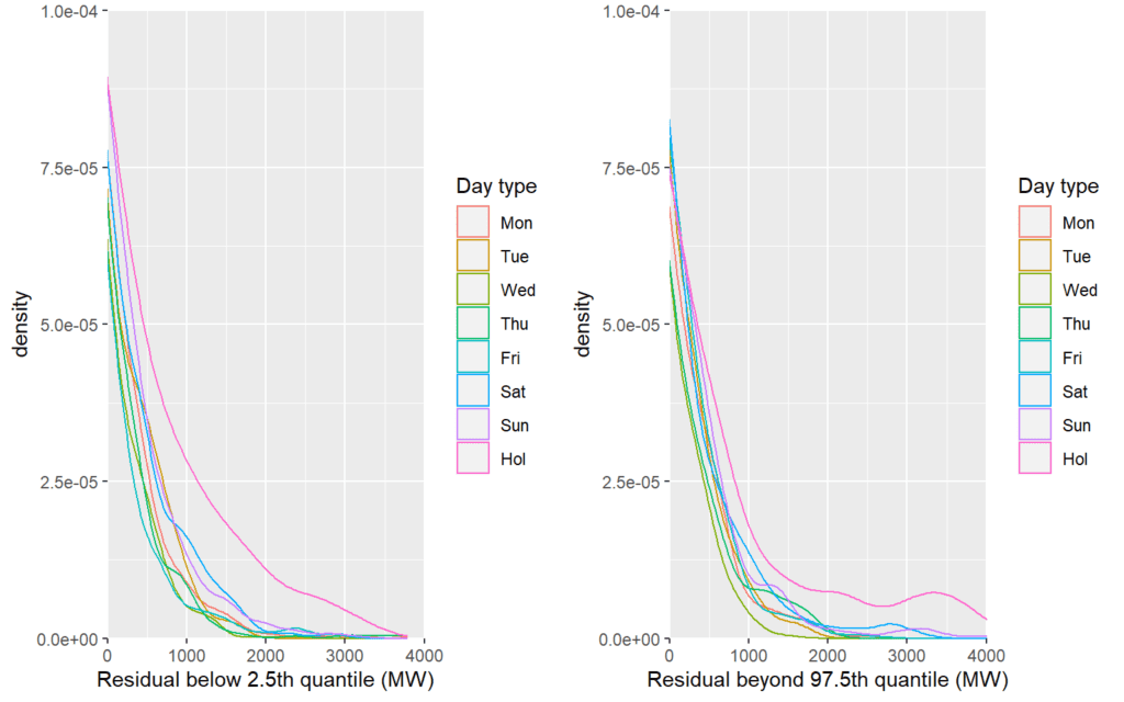
6.1.3 Tail model parameters
We can visualise the parameters of the extreme value theory distributions. The scale parameters vary conditionally, whereas there is only a single shape parameter for each cross-fold.
scale_l_plt <- ggplot(fit_data[missing_index], aes(x=gpd_scale_l,
                                                      fill=kfold)) +
  geom_density(aes(color=kfold), alpha=0) +
  xlab("Left tail scale parameter")
scale_r_plt <- ggplot(fit_data[missing_index], aes(x=gpd_scale_r,
                                                      fill=kfold)) +
  geom_density(aes(color=kfold), alpha=0) +
  xlab("Right tail scale parameter")

shape_l_plt <- ggplot(fit_data[missing_index], aes(x=gpd_shape_l,
                                                      fill=kfold)) +
  geom_histogram(aes(color=kfold)) +
  xlab("Left tail shape parameter")
shape_r_plt <- ggplot(fit_data[missing_index], aes(x=gpd_shape_r,
                                                      fill=kfold)) +
  geom_histogram(aes(color=kfold)) +
  xlab("Right tail shape parameter")

ggarrange(scale_l_plt, scale_r_plt, shape_l_plt, shape_r_plt, nrow=2, ncol=2)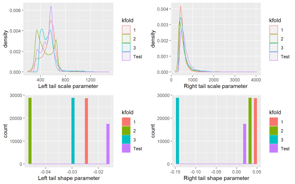
Some of the fitted parameters are quite significantly different between cross-folds, particularly the shapes. This could be due to the finite size of the samples and the somewhat random-allocation of samples to cross-folds. The tables below present the number of data points used to fit these tail models for first the left then right tail, by cross-fold.
## kfold
##    1    2    3 Test
##  769 1222  889  739
xtabs(~kfold, fit_data[tail_r_resid>0&missing_data==F])## kfold
## 1 2 3 Test
## 1145 1121 934 477In model fitting, each tail model has at most a few thousand data points and in most cases a few hundred, and it possible that this is leading to an undesirable amount of variation in the parameters of the models between folds. This is particularly noticeable for the models of the right tails, with cross-fold 3 having a “light-tailed” model (with a negative shape), but the other folds all having somewhat “heavy-tailed” models.
6.2 Evaluating tail quantile predictions
We evaluate these tail distributions for a selection of quantiles in the left and right tails, from the 99th to the 99.99th in the right tail and equivalent in the left tail. These are added to the mqr_pred object, with the other quantiles.
mqr_pred <- qgam_update$mqr_pred
for(prob in c(0.99,0.995,0.9975,
              0.999,0.9995, 0.99975,
              0.9999, 0.99999, 0.999999)){
  mqr_pred[[paste0("q",round(prob*100, 6))]] <-  mqr_pred[[paste0("q",100-tail_from)]] +
    qgpd(p=rep((prob-1+tail_from/100)/(tail_from/100), nrow(fit_data)),
         shape=na.aggregate(fit_data$gpd_shape_r),
         scale=fit_data$gpd_scale_r)
  mqr_pred[[paste0("q",round(1-prob, 6)*100)]] <-  mqr_pred[[paste0("q",tail_from)]] -
    qgpd(p=rep((prob-1+tail_from/100)/(tail_from/100), nrow(fit_data)),
         shape=na.aggregate(fit_data$gpd_shape_l),
         scale=fit_data$gpd_scale_l)
}
mqr_pred <- mqr_pred[,
                     order(as.numeric(gsub("q","",colnames(mqr_pred)))),with=F]
6.3 Calibration
We re-evaluate the calibration of the model, with the addition of the extreme quantiles.
ev_reliability <- reliability(mqr_pred[missing_index],
                              realisations[missing_index],
                              plot.it = F)
pr <- c(0.01, 0.1,1,10,50,90,99, 99.9, 99.99)

p <- ggplot(data=ev_reliability,
       aes(x=Nominal, y=Empirical,
           text=paste('Nominal: ', paste0(round(Nominal*100,2),"%"),
                      '<br>Empirical: ', paste0(round(Empirical*100,2),"%")))) +
  geom_line(color="blue", group=1) +
  geom_point(color="blue")+
  geom_abline(slope = 1, intercept = 0, linetype = 'dashed') +
  scale_x_continuous("Nominal",labels = percent) +
  scale_y_continuous("Empirical",labels = percent) +
  coord_cartesian(xlim = c(0, 1),
                  ylim = c(0, 1))
ggplotly(p, tooltip=c("text"))
It is difficult to see exactly what is happening in the tails. We therefore take an inverse normal transformation of the plotted data, which essentially zooms in on both the left and right tail of the QQ plot.
ev_reliability$qNominal <- qnorm(ev_reliability$Nominal)
ev_reliability$qEmpirical <- qnorm(ev_reliability$Empirical)
unQ <- qnorm(pr/100)

p <- ggplot(data=ev_reliability,
       aes(x=qNominal, y=qEmpirical,
           text=paste('Nominal: ', paste0(round(Nominal*100,2),"%"),
                      '<br>Empirical: ', paste0(round(Empirical*100,2),"%")))) +
  geom_line(color="blue", aes(group=1)) +
  geom_point(color="blue")+
  geom_abline(slope = 1, intercept = 0, linetype = 'dashed') +
  scale_x_continuous("Nominal", breaks = unQ,
                     labels = paste0(pr,"%")) +
  scale_y_continuous("Empirical", breaks = unQ,
                     labels = paste0(pr,"%")) +
  coord_cartesian(xlim = c(min(unQ), max(unQ)),
                  ylim = c(min(unQ), max(unQ)))
ggplotly(p, tooltip=c("text"))
The calibration of the models may not be as good in the extremes of the tails, beyond the 0.1st quantile and the 99.9th, However, it is important to bear in mind that there are only a very small number of data points for checking this calibration (e.g. there are only around 100 data points to the left of the 0.1th quantile and to the right of the 99.9th quantile). One possible factor is that the Generalised Pareto Distribution has infinite support, meaning that the model could allow any positive (or negative) values of demand, from \(-\infty\) to \(\infty\).
Nevertheless, we adopt these tail models within our forecasts, noting that they need to be used cautiously given the difficulty in verifying their calibration.
6.4 Sharpness
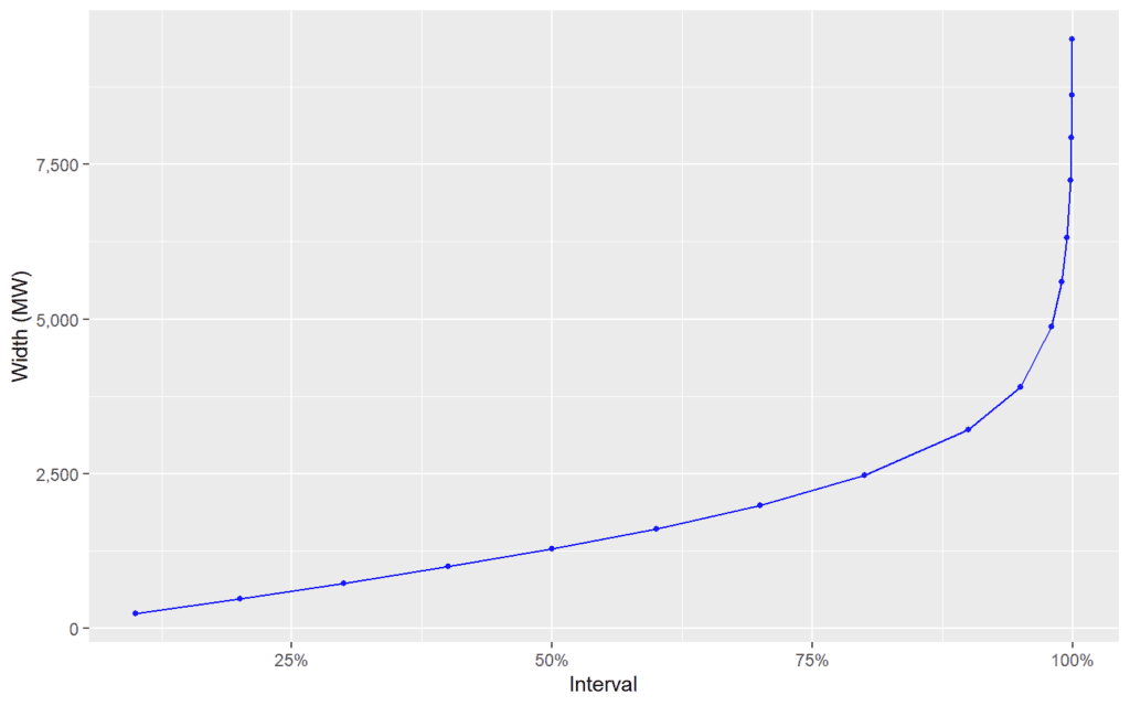
As previously, we can understand the sharpness of the extreme predictions by looking at the width interquantile ranges. This time we look at the intervals widths to the 99.99th central range..
As before, we can partition by type of day, which shows that the extremes of the distribution become much wider on holidays.
sharpness_combined_daytypes <- c()
for(dow_Rph in unique(fit_data$dow_Rph)){
  level_index <- which((fit_data$missing_data == F)
                       & (fit_data$dow_Rph == dow_Rph))
  sharpness_daytype <- sharpness(mqr_pred[level_index])
  sharpness_daytype$dow_Rph <- dow_Rph
  sharpness_combined_daytypes <- rbind(sharpness_combined_daytypes, sharpness_daytype)
}
sharpness_combined_daytypes <- setDT(sharpness_combined_daytypes)
sharpness_combined_daytypes[, dow_Rph:=ordered(dow_Rph, levels=dow_Rph_levels)]

ggplot(setDT(sharpness_combined_daytypes)[Interval<0.9999],
       aes(x=Interval, y=Width, group=dow_Rph)) +
  geom_line(aes(color=dow_Rph)) +
  geom_point(aes(color=dow_Rph), size=1) +
  scale_color_discrete("Type of day") + scale_x_continuous(labels=percent) +
  scale_y_continuous("Width (MW)", labels=comma)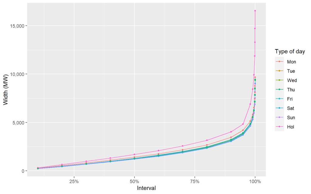
7 Probability integral transform
We take the Probability Integral Transform (PIT) of each realisation of net demand. This is the probability of that value of demand having been realised, based on the fitted model of the probability density.
7.1 Auto-correlation and partial auto-correlation
We can examine the auto-correlation and partial auto-correlation of the PIT of the forecast. This suggests that there is a strong correlation in the values of demand observed from one hour to the next, but also there are reasonably strong daily and weekly patterns. It is interesting that the half-hourly auto-correlation persists strongly for several days – in the day-ahead forecast, the auto-correlation decays much more quickly to leave only the daily pattern.
pit_acf <- acf(fit_data$pit, na.action = na.pass, lag.max = 48*10, plot = F)
pit_acf <- data.table(lag = pit_acf$lag, acf = pit_acf$acf)
pit_acf$max_lag <- 48*10
pit_acf_short <- pit_acf[lag<=48]
pit_acf_short$max_lag <- 48
pit_acf <- rbind(pit_acf, pit_acf_short)
p <- ggplot(pit_acf, aes(x=lag, y=0, xend=lag, yend=acf,
                         text=paste('Lag: ', lag,
                                    '<br>Autocorrelation: ', paste0(round(acf*100,2),"%")))) +
  geom_segment(color="blue") +
  geom_point(aes(x=lag, y=acf), color="blue") +
  geom_hline(yintercept = 0, color='darkgrey') +
  geom_hline(yintercept = 0.05, linetype='dashed', color='red') +
  geom_hline(yintercept = -0.05, linetype='dashed', color='red')+
  scale_x_continuous("Lag") +
  scale_y_continuous("Autocorrelation", labels=percent)  +
  facet_wrap(~paste("Maximum lag: ",max_lag), scales="free_x")
ggplotly(p, tooltip=c("text"))
rm(pit_acf, pit_acf_short)pit_pacf <- pacf(fit_data$pit, na.action = na.pass, lag.max = 48*10, plot = F)
pit_pacf <- data.table(lag = pit_pacf$lag, pacf = pit_pacf$acf)
pit_pacf$max_lag <- 48*10
pit_pacf_short <- pit_pacf[lag<=48]
pit_pacf_short$max_lag <- 48
pit_pacf <- rbind(pit_pacf, pit_pacf_short)
p <- ggplot(pit_pacf, aes(x=lag, y=0, xend=lag, yend=pacf,
text=paste('Lag: ', lag,
'<br>Partial autocorrelation: ', paste0(round(pacf*100,2),"%")))) +
geom_segment(color="blue") +
geom_point(aes(x=lag, y=pacf), color="blue") +
geom_hline(yintercept = 0, color='darkgrey') +
geom_hline(yintercept = 0.05, linetype='dashed', color='red') +
geom_hline(yintercept = -0.05, linetype='dashed', color='red')+
scale_x_continuous("Lag") +
scale_y_continuous("Partial autocorrelation", labels=percent) +
facet_wrap(~paste("Maximum lag: ",max_lag), scales="free_x")
ggplotly(p, tooltip=c("text")) rm(pit_pacf, pit_pacf_short)7.2 Calibration of the PIT
We can also visualise the calibration of the model by examining the extent which the predictions deviate from the quantiles implied by the model after taking the PIT. We include consistency bands, where these are adjusted to reflect the strong correlation at the half-hour lag. (These plots are based on those used by Browell and Fasiolo in this pre-print: https://arxiv.org/abs/2103.10335 and use some of the code that accompanied that paper.)
worm_plot_data <- worm_data(fit_data[missing_index, pit], cov_max_lag = 1)
p <- ggplot(worm_plot_data, aes(x=theoretical,y=sample,group=type,
                           text=paste('Theoretical: ',
                                      paste0(round(pnorm(theoretical)*100,2),"%"),
                                      '<br>Deviation: ',
                                      paste0(round(sample,2))))) +
  geom_line(aes(color=type, lty=type))+
  scale_x_continuous("Nominal", breaks = unQ,
                     labels = paste0(pr,"%")) +
  scale_y_continuous("Deviation") +
  coord_cartesian(xlim = c(qnorm(0.00025), qnorm(0.99975)),
                  ylim = c(-0.6,0.6), expand=F) +
  scale_color_manual(NULL,
                     breaks = c("Lower", "PIT", "Upper"),
                     values = c("Lower" = "black",
                                "PIT" = "red",
                                "Upper" = "black")) +
  scale_linetype_manual(NULL,
                     breaks = c("Lower", "PIT", "Upper"),
                     values = c("Lower" = "dotted",
                                "PIT" = "solid",
                                "Upper" = "dotted"))
ggplotly(p, tooltip=c("text"))
The PIT of the forecast will be used further in Work Package 4.
8 Visualising the forecasts
We can visualise the probabilistic forecasts using a fan chart.
8.1 Rolling forecasts over 12 weeks
In the animation below, we show 12 weeks of day-ahead forecasts, starting from 20th January. The fan chart covers the 0.5th to 99.5th quantiles, such that 99% of realised demands should fall within the area of the fan-plot. We also include dashed lines representing the range between the 0.25% and 99.75% quantile (the 99.5% interquantile range). Each frame of the animation corresponds to a different forecast issue time, with the issued forecasts spanning the period from 5am on the following day, to 4:30am two days after the forecast is issued. We overlay the actual realised value of demand in black.
start_date <- ymd_hm("2019/01/20 11:00", tz="Europe/London")
end_date <- start_date + days(7*4*3)
indexes <- which(fit_data$issueTime>=start_date &
                   fit_data$issueTime<end_date &
                   fit_data$missing_data==F)
p <- ggplotmqr(mqr_pred[indexes],
               targetTimes = fit_data[indexes, localtargetTime],
               issueTime = fit_data[indexes, issueTime],
               quantiles=paste0("q",100*c(0.005, 0.01, 0.025,
                                          seq(0.05, 0.95, by=0.05),
                                          0.975, 0.99, 0.995)),
               cols = list(type="colorRampPalette",
                           func=colorRampPalette(c("lightgoldenrod1","firebrick1"))))
p_anim <- p +
  geom_line(data=fit_data[indexes],
            aes(x=localtargetTime, y=net_demand,
                color="Actual net demand", linetype="Actual net demand",
                group=issueTime), size=1) +
  geom_line(data=data.table(localtargetTime  = fit_data[indexes, localtargetTime],
                            q0.25  = mqr_pred[indexes, q0.25],
                            issueTime  = fit_data[indexes, issueTime]),
            aes(x=localtargetTime, y=q0.25, color="99.5% interval",linetype="99.5% interval",
                group=issueTime)) +
  geom_line(data=data.table(localtargetTime  = fit_data[indexes, localtargetTime],
                            q99.75  = mqr_pred[indexes, q99.75],
                            issueTime  = fit_data[indexes, issueTime]),
            aes(x=localtargetTime, y=q99.75, color="99.5% interval",linetype="99.5% interval",
                group=issueTime)) +
  scale_x_datetime(name="Time (BST)",
                   sec.axis=sec_axis(~difftime(., min(.)-60*60*min_lead_time, units="hours"),
                                     name="Lead time (hours)"),
                   expand = expansion(mult = c(0,0))) +
  scale_color_manual(name=NULL,
                     breaks = c("Actual net demand", "99.5% interval"),
                     values = c("Actual net demand" = "black", "99.5% interval" = "firebrick1")) +
  scale_linetype_manual(name=NULL,
                     breaks = c("Actual net demand", "99.5% interval"),
                     values = c("Actual net demand" = "solid", "99.5% interval" = "dotdash")) +
  theme_bw() +
  transition_states(as.factor(with_tz(issueTime, "Europe/London"))) +
  view_follow(fixed_y = T) +
  scale_y_continuous(name="Net demand (MW)", labels = comma, expand = expansion(mult = c(.1, .1))) +
  ggtitle("Issue: {closest_state} (BST)")
animation <- animate(p_anim, device = "png", fps = 3, height = 450, width =600,
                     nframes = length(unique(fit_data[indexes, issueTime])),
                     detail=2)

invisible(anim_save("qgam_pred_daysaheadnetdemand.gif", animation = animation))
knitr::include_graphics("qgam_pred_daysaheadnetdemand.gif")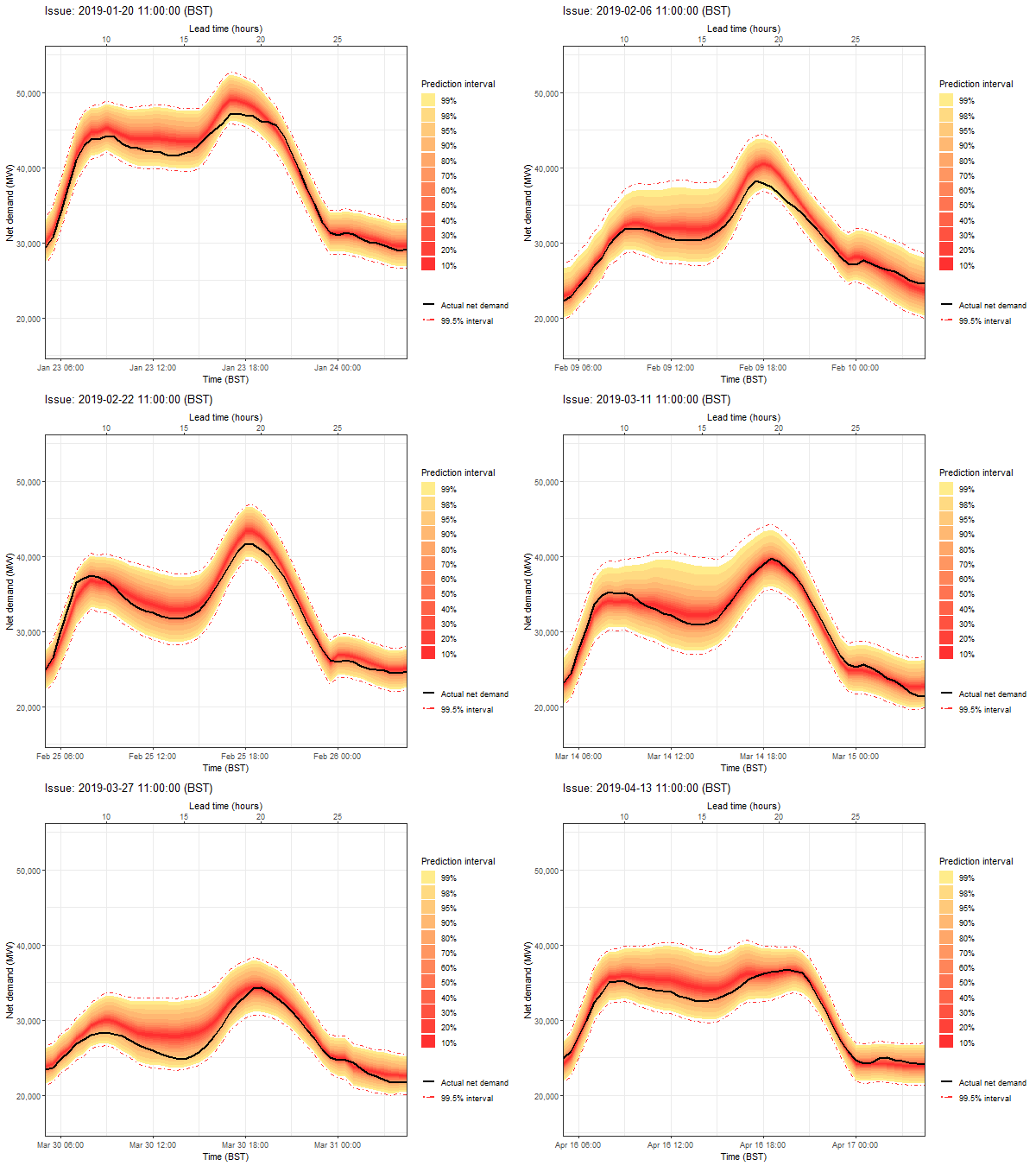
8.2 Specific example
As a specific example, we examine the forecast that would have been issued on the 9th September 2019, for the day beginning at 5am on September 12th.
start_date <- ymd_hm("2019/09/09 11:00", tz = "Europe/London")
end_date <- start_date + days(1)
indexes <- which(fit_data$issueTime>=start_date &
                   fit_data$issueTime<end_date)
p <- ggplotmqr(mqr_pred[indexes],
               targetTimes = fit_data[indexes, localtargetTime],
               issueTime = fit_data[indexes, issueTime],
               quantiles=paste0("q",100*c(0.005, 0.01, 0.025,
                                          seq(0.05, 0.95, by=0.05),
                                          0.975, 0.99, 0.995)),
               cols = list(type="colorRampPalette",
                           func=colorRampPalette(c("lightgoldenrod1","firebrick1"))))
p <- p +
  geom_line(data=fit_data[indexes],
            aes(x=localtargetTime, y=net_demand,
                color="Actual net demand", linetype="Actual net demand",
                group=issueTime), size=1) +
  geom_line(data=data.table(localtargetTime  = fit_data[indexes, localtargetTime],
                            q0.25  = mqr_pred[indexes, q0.25],
                            issueTime  = fit_data[indexes, issueTime]),
            aes(x=localtargetTime, y=q0.25, color="99.5% interval",linetype="99.5% interval",
                group=issueTime)) +
  geom_line(data=data.table(localtargetTime  = fit_data[indexes, localtargetTime],
                            q99.75  = mqr_pred[indexes, q99.75],
                            issueTime  = fit_data[indexes, issueTime]),
            aes(x=localtargetTime, y=q99.75, color="99.5% interval",linetype="99.5% interval",
                group=issueTime)) +
  scale_x_datetime(name="Time (BST)",
                   sec.axis=sec_axis(~difftime(., min(.)-60*60*min_lead_time, units="hours"),
                                     name="Lead time (hours)"),
                   expand = expansion(mult = c(0,0))) +
  scale_color_manual(name=NULL,
                     breaks = c("Actual net demand", "99.5% interval"),
                     values = c("Actual net demand" = "black", "99.5% interval" = "firebrick1")) +
  scale_linetype_manual(name=NULL,
                     breaks = c("Actual net demand", "99.5% interval"),
                     values = c("Actual net demand" = "solid", "99.5% interval" = "dotdash")) +
  theme_bw() +
  scale_y_continuous(name="Net demand (MW)", labels = comma, expand = expansion(mult = c(.1, .1))) +
  ggtitle(paste0("Issue: ", start_date, " (BST)"))
p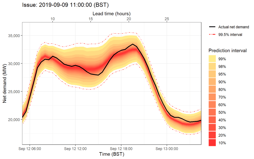
The forecast is less sharp than the forecast for the same day that is issued on the 11th September, at the day-ahead stage.
9 Summary
In this notebook we demonstrated a methodology for generating probabilistic forecasts of national net-demand at the day-ahead stage, using Generalised Additive Models and Quantile Regression. We demonstrated that the forecasts were well calibrated, even for some extreme quantiles of the predictive distribution, and that they are skillful compared to a standard benchmark model.
Some possible areas for further research could include:
- Further exploration and research into the modeling of extreme quantiles of the tails of the predictive distributions.
- Methods to incorporate the ways in which NGESO adjusts forecasts manually to account for holidays and special events.
In WP4, these forecasts will be applied to a variety of decision-making use cases.
Finally, we save the forecast data for later sections of the project.
forecast_output <- cbind(fit_data[,.(targetTime,issueTime,leadTime,
                                     metIssueTime, metLeadTime,
                                    kfold,missing_data,
                                    net_demand, gam_pred, pit,
                                    gpd_scale_r, gpd_shape_r,
                                    gpd_scale_l, gpd_shape_l)],
                         mqr_pred)
forecast_output <- forecast_output[order(targetTime, leadTime)]
forecast_output[,targetTime:=as.character(targetTime)]
forecast_output[,issueTime:=as.character(issueTime)]
fwrite(forecast_output,
       file = paste0("~/RProjects/reactforecasting/data/output/",
                     "daysahead_netdemand.csv"))
And we save the data as an R object.
10 Session Info
## R version 4.0.4 (2021-02-15)
## Platform: x86_64-w64-mingw32/x64 (64-bit)
## Running under: Windows 10 x64 (build 19042)
##
## Matrix products: default
##
## locale:
## [1] LC_COLLATE=English_United Kingdom.1252  LC_CTYPE=English_United Kingdom.1252    LC_MONETARY=English_United Kingdom.1252 LC_NUMERIC=C                            LC_TIME=English_United Kingdom.1252
##
## attached base packages:
## [1] parallel  splines   stats     graphics  grDevices utils     datasets  methods   base
##
## other attached packages:
##  [1] gganimate_1.0.7     plotly_4.9.4.1      scales_1.1.1        zoo_1.8-9           ROOPSD_0.2.5        ggpubr_0.4.0        gifski_1.4.3        mgcViz_0.1.6        rgl_0.105.22        qgam_1.3.2          ProbCast_0.0.0.9000 quantreg_5.86       SparseM_1.81        mgcv_1.8-34         evgam_0.1.4         fst_0.9.4           mvnfast_0.2.7       gamboostLSS_2.0-5   mboost_2.9-5        stabs_0.6-4         doSNOW_1.0.19       snow_0.4-3          iterators_1.0.13    foreach_1.5.1       gamlss_5.3-4        nlme_3.1-152        gamlss.dist_5.3-2   MASS_7.3-53         gamlss.data_6.0-1   lubridate_1.7.10    forcats_0.5.1       stringr_1.4.0       dplyr_1.0.5         purrr_0.3.4         readr_1.4.0         tibble_3.1.0        ggplot2_3.3.3       tidyverse_1.3.0     tidyr_1.1.3
## [40] data.table_1.14.0
##
## loaded via a namespace (and not attached):
##   [1] readxl_1.3.1            backports_1.2.1         plyr_1.8.6              lazyeval_0.2.2          crosstalk_1.1.1         digest_0.6.27           htmltools_0.5.1.1       viridis_0.5.1           fansi_0.4.2             magrittr_2.0.1          doParallel_1.0.16       openxlsx_4.2.4          modelr_0.1.8            matrixStats_0.59.0      lpSolve_5.6.15          prettyunits_1.1.1       colorspace_2.0-0        rvest_1.0.0             haven_2.3.1             xfun_0.22               crayon_1.4.1            jsonlite_1.7.2          libcoin_1.0-8           lme4_1.1-27.1           survival_3.2-10         glue_1.4.2              gtable_0.3.0            nnls_1.4                webshot_0.5.2           MatrixModels_0.5-0      car_3.0-11              abind_1.4-5             mvtnorm_1.1-2
##  [34] DBI_1.1.1               GGally_2.1.1            rstatix_0.7.0           miniUI_0.1.1.1          Rcpp_1.0.7              isoband_0.2.4           progress_1.2.2          viridisLite_0.3.0       xtable_1.8-4            units_0.7-2             proxy_0.4-26            foreign_0.8-81          Formula_1.2-4           htmlwidgets_1.5.3       httr_1.4.2              RColorBrewer_1.1-2      ellipsis_0.3.1          farver_2.1.0            pkgconfig_2.0.3         reshape_0.8.8           transformr_0.1.3        sass_0.3.1              dbplyr_2.1.0            utf8_1.2.1              labeling_0.4.2          tidyselect_1.1.0        rlang_0.4.10            manipulateWidget_0.10.1 later_1.1.0.1           munsell_0.5.0           cellranger_1.1.0        tools_4.0.4             cli_2.3.1
##  [67] generics_0.1.0          broom_0.7.5             evaluate_0.14           fastmap_1.1.0           yaml_2.2.1              knitr_1.31              fs_1.5.0                zip_2.1.1               mime_0.10               xml2_1.3.2              compiler_4.0.4          rstudioapi_0.13         gamm4_0.2-6             curl_4.3                e1071_1.7-8             ggsignif_0.6.2          reprex_1.0.0            tweenr_1.0.2            bslib_0.2.4             stringi_1.5.3           highr_0.8               ps_1.6.0                lattice_0.20-41         Matrix_1.3-2            classInt_0.4-3          nloptr_1.2.2.2          vctrs_0.3.6             pillar_1.5.1            lifecycle_1.0.0         jquerylib_0.1.3         cowplot_1.1.1           conquer_1.0.2           httpuv_1.5.5
## [100] R6_2.5.0                promises_1.2.0.1        KernSmooth_2.23-18      gridExtra_2.3           rio_0.5.27              Lmoments_1.3-1          codetools_0.2-18        boot_1.3-26             assertthat_0.2.1        withr_2.4.1             hms_1.0.0               quadprog_1.5-8          grid_4.0.4              rpart_4.1-15            class_7.3-18            minqa_1.2.4             rmarkdown_2.7           inum_1.0-4              carData_3.0-4           sf_1.0-2                partykit_1.2-13         shiny_1.6.0